
Trusted World Clients









Responsive Web Design Services That Convert Traffic into Buyers

Responsive Web Design Services That Convert Traffic into Buyers
Google indexes and ranks your wesite based on its mobile version. If layouts break, text is tiny, or pages crawl on a phone, rankings slip, and visitors leave before they see your offer.
WPWeb Infotech builds one custom website that adapts to every screen, with one URL, one set of content, and clean code. Search engines can crawl it easily, every link points to one page, and the visitors you earn stay long enough to act.
Our Wide Range of Responsive Web Design Services
Every project starts with a different problem: a dated website, a landing page that doesn’t convert, a checkout losing sales. Choose the service closest to yours, or combine them into a single build.

Responsive Website Design
Custom-designed corporate and service websites built mobile-first, so your brand and message stay sharp from the smallest phone to the widest monitor.
- Flexible Grids and Fluid Images
- Custom UI With Scalable Typography and Imagery
- Content That Reflows Without Losing Hierarchy

Responsive Website Redesign
Fix what’s pushing visitors away on mobile. We redesign your existing website for every screen size, keeping the content and structure that already work.
- Updated Navigation and Page Hierarchy
- Page-by-Page Audit of Mobile Issues
- Readable Type and Spacing for Phones

Responsive eCommerce Design
Storefronts built for mobile shopping that cut cart abandonment and lift mobile sales, from the first product view to the final payment.
- Swipeable, Zoomable Product Galleries
- Easy-To-Use Filters and Product Search
- Streamlined Checkout With Fewer Form Fields

Responsive Landing Page Design
Focused campaign and lead-gen pages designed to be phone-first, so visitors from ads, email, and social campaigns land on a page that gets to the point fast.
- Single-Goal Layouts With One Clear Action
- Sticky CTAs and Click-To-Call Buttons
- Layouts Ready for A/B Testing
Why Choose Us For Responsive Web Design Services?
As a responsive web design company with 10+ years of experience, we turn websites into dependable growth channels. Our designers and developers work as one team, so your website looks right, feels natural, and guides visitors from first tap to final decision.
-
 Seamless Website Experiences Across Screen Sizes
 -
 Mobile-First Layouts Built Around Your Brand
 -
 Touch-Friendly Navigation & User Journeys
 -
 Consistent Design Across Devices & Browsers
 -
 2 Week Risk-Free Trial
 -
Onboarding Within 24 Hours


Powered by Leading AI Technologies



Stop Losing Mobile Leads. Start Converting Them!
Responsive Web Design Vs Mobile-First Web Design
Responsive design makes a website adapt to any screen. Mobile-first is one way to build it, starting small and scaling up. They’re not rivals, but they suit different projects.
Benefits of Our Responsive Web Design Services
A responsive website does more than fit smaller screens. It builds trust faster, supports search visibility, lasts longer, and matches how visitors actually browse.

Competitive Edge
Buyers compare options on their phones, often in seconds. A polished, easy-to-use website signals credibility before a word is read, while competitors with clumsy mobile pages lose visitors to you.

Enhanced SEO Performance
Search engines reward pages that are readable, don’t shift while loading, and are easy to use on a phone. Meeting those page-experience standards gives your content a stronger chance to rank.

Future-Proof Solutions
New phones, foldables, and tablets keep launching every year. Fluid layouts adapt to new screen sizes far better than fixed ones, so you avoid constant device-specific fixes and early redesigns.

Tailored User Experience
Your audience doesn’t browse like anyone else’s. We shape menus, content order, and CTAs around how your visitors actually use your website, so each page feels made for the device in their hand.
What’s Included in Our Responsive Web Design Services
From first wireframe to post-launch support, every project covers the design, testing, and optimization work needed to make your website perform well on any device.

-

Audience & Device Research
-
Responsive UX Design & Content Hierarchy
-
Responsive Website Wireframes
-
Interactive Prototypes for Every Breakpoint
-
Responsive UI Design & Design System
-
Mobile-Friendly Form Design
-
Accessibility Built to WCAG Standards
-
Speed & Core Web Vitals Optimization
-
Pre-Launch QA & Bug Fixing
-
Post-Launch Support & Optimization

Our Latest Work
These are some of the responsive websites our team has recently launched, each designed to work smoothly on phones, tablets, and desktops.
We designed and developed the Storybook Stitches website to provide a seamless, engaging shopping experience for parents. Using soft pastel tones, clear typography, intuitive navigation, and customization-friendly layouts, we created a platform that highlights their high-quality baby and kids’ apparel, builds trust, and boosts user engagement and conversions.
Increase in Conversions
Growth in Sales

We redesigned Nature’s Way Farms with a modern, user-friendly interface that highlights their premium organic products. The site features an engaging banner, intuitive navigation, high-quality imagery, and trust-building elements like testimonials and a blog. Fully mobile-responsive, it ensures a seamless shopping experience while enhancing usability, engagement, and conversions.
Faster Page Loading
Mobile-Responsive Interface

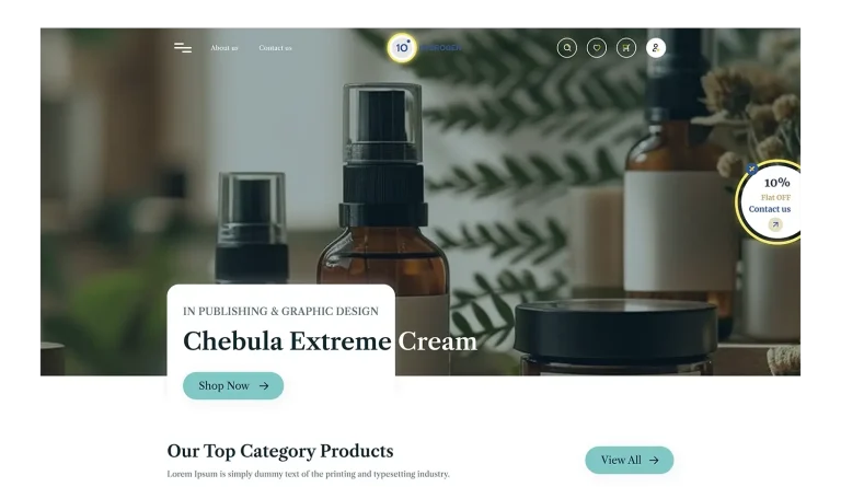
10 Hydrogen needed a calming, refined platform for premium skincare shopping. We created a serene, user-friendly eCommerce site with soothing teal tones, elegant fonts, and easy navigation. The responsive design highlights products, letting shoppers explore and buy skincare essentials effortlessly on any device.
Faster Page Load Time
Increase in Mobile Usability
Looking to Build a Responsive Website That Wins More Leads?
Tell us about your project and get a tailored plan, timeline, and quote for your responsive website, with no obligation.
Our Process for Responsive Web Design Services
At WPWeb Infotech, we follow a clear five-step process that keeps you informed and accounts for every screen size, from the first call to launch day.

Discovery & Device Audit
We study your analytics, audience, and competitors to find exactly where mobile visitors drop off, then agree on goals, priority devices, and key pages with you.

Layout Blueprint
We design mobile layouts first, then tablet and desktop. You review clickable prototypes and approve structure and flows before any visual design or code begins.

Design & Development
Approved layouts become polished UI and clean, responsive code, shared on a staging site with milestone demos, so you can review real progress at every stage.

Testing & Refinement
We test layouts, forms, and interactions across real devices and major browsers, then fix issues and fine-tune breakpoints so everything works as intended before launch day.

Launch & Support
We manage go-live, then track performance and visitor behavior after launch, staying on hand for updates, fixes, and improvements as your traffic and business goals grow.
What Our Clients Say About WPWeb Infotech
Hiring a web design partner is a big decision. Hear from the businesses that trusted us with theirs, and what working together was actually like.


Trusted by 200+ happy clients





FAQs
How much do responsive web design services cost?
It depends on page count, custom UI work, platform, integrations, and whether it’s a new build or a redesign. A brochure site costs far less than an eCommerce store. Share your requirements and we’ll send a fixed-price quote after a free consultation.
How long does it take to build a responsive website?
A small to mid-size site typically takes 4-8 weeks. eCommerce stores and custom builds take longer. The biggest variable is how quickly you provide feedback, content, and approvals.
How do I know if my website needs a responsive redesign?
You likely need one if your pages scroll sideways, your mobile bounce rate is well above desktop, or mobile visitors convert far less than desktop ones. A quick device audit will show exactly where the problems are.
Can my existing website be made responsive?
Yes, we rework layouts and templates without rebuilding from scratch. If the site relies on fixed-width layouts or an outdated theme, a redesign is usually faster and cheaper than patching it.
Can responsive design improve my website’s performance?
Yes, we help businesses improve website’s performance by pairing responsive design with image optimization, lean code, and lazy loading, so pages load quickly.
Is a mobile-friendly website the same as a responsive one?
No. A mobile-friendly site works on phones but may rely on a fixed or separate mobile layout. A responsive site uses one flexible layout that adjusts to every screen size, so you maintain only one site and avoid mismatches between versions.
Which platforms do you build responsive websites on?
We build on WordPress, WooCommerce, Shopify, Magento, and custom stacks. We recommend the platform that suits your content, product catalog, and growth plans.
Build, Scale & Succeed with WPWeb Infotech
From idea to launch and beyond, WPWeb Infotech helps businesses build scalable digital products with expert guidance, solutions, and support. Explore our services and resources, or contact us for assistance.