Table of Contents
In the ever-evolving digital domain, a well-designed website serves as the virtual storefront of your brand. Users form instant opinions in 50 milliseconds based on the visual appeal and functionality of your site, making web design a critical aspect of online success. As technology advances and user expectations rise, it becomes imperative to stay abreast of the principles that underpin effective web design.
Web design principles are the foundational guidelines that govern the creation of aesthetically pleasing, intuitive, and functional websites. They are the bedrock upon which a seamless user experience is built. Understanding the significance of these web design principles is akin to unlocking the door to a user-friendly digital space that not only captivates visitors but also keeps them engaged and encourages exploration.
Implementing web design principles involves a delicate balance between artistic creativity and technical precision. From the thoughtful use of color and experimental typography to the strategic placement of navigation elements, every decision plays a role in shaping the user’s journey. In this blog post, we’ll dive into actionable insights on how to seamlessly integrate these principles into your website, ensuring it stands out in the competitive online landscape.
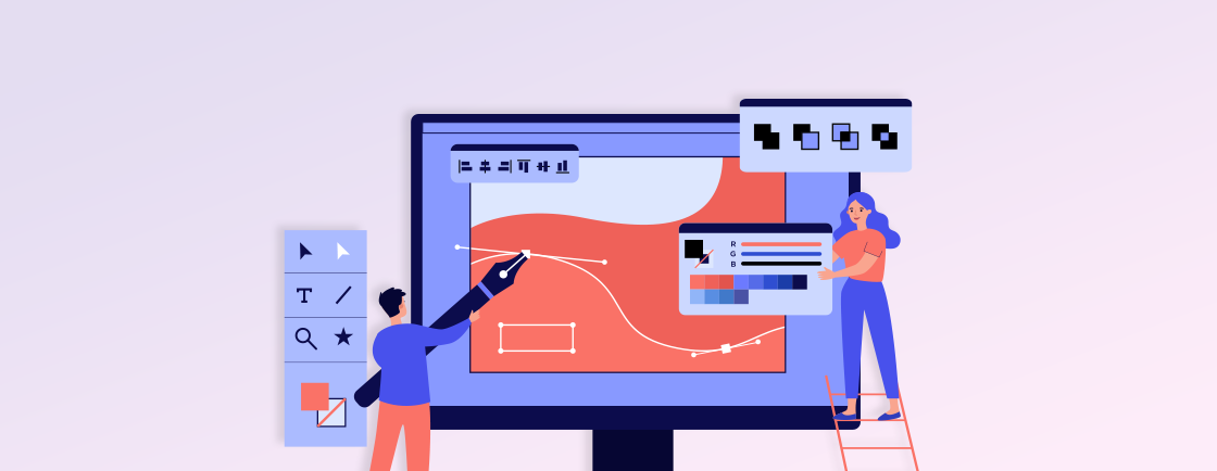
What are Web Design Principles?
Web design principles serve as the foundational framework for creating websites that are both visually appealing and user-centric. They guide the arrangement of elements on a webpage, influencing everything from aesthetics to functionality, ultimately shaping the overall user experience.
- Visual Hierarchy: Establishing a clear visual hierarchy is paramount for guiding users through content effortlessly. By strategically emphasizing critical elements, such as headlines and calls to action, you can direct user attention and enhance the overall user experience, ensuring they engage with your content in a meaningful way.
- Responsive Design: The prevalence of various devices necessitates a responsive design approach. Ensuring your website adapts seamlessly to different screen sizes and resolutions is vital for enhancing accessibility. This adaptability not only reaches a broader audience but also provides a consistent and enjoyable experience across various platforms.
- Simplicity and Consistency: Embracing simplicity in design fosters user comprehension and engagement. A clutter-free layout and consistent use of color schemes and typography across pages instill a sense of cohesion. This, in turn, makes the website intuitive and easy to navigate, creating a positive and memorable user experience.
- Usability and Accessibility: Prioritizing usability and web accessibility ensures that your website caters to users with diverse needs. Implementing clear navigation, descriptive labels, and providing alternative text for images enhances the overall accessibility of your site. This commitment to inclusivity contributes to a more positive and user-friendly web experience.
- Loading Speed Optimization: Users today expect instant access to information, making the optimization of loading speed crucial. Techniques such as image compression, script minimization, and effective use of browser caching are instrumental in creating a fast-loading website. Prioritizing loading speed not only prevents user frustration but also positively impacts search engine rankings.
To create websites that captivate visitors and provide a seamless user journey, understanding and implementing web design principles are crucial. Explore these principles for actionable insights that exceed user expectations, fostering a positive online presence. For tailored solutions, seek assistance from web design services providers. Their expertise ensures your website not only meets industry standards but stands out in the competitive digital landscape, turning your vision into a visually stunning and highly functional reality.
Why are Web Design Principles Important?
Web design principles are the cornerstone of a successful online presence, influencing the way users interact with and perceive your website. Understanding their importance is crucial for creating a digital space that not only attracts but also retains visitors.
- User Experience Enhancement: Web design principles focus on optimizing user experience, ensuring that visitors find the information they seek easily. This emphasis on usability and accessibility contributes to a positive interaction, fostering user satisfaction and loyalty.
- Brand Consistency: Consistency in design elements, such as color schemes and typography, reinforces brand identity. A cohesive visual experience across your website builds trust, making your brand easily recognizable and memorable to visitors.
- Mobile Responsiveness: With the surge in mobile device usage, web design principles emphasize responsiveness. Ensuring your site adapts seamlessly to various screen sizes enhances accessibility, expanding your reach to users on different devices and platforms.
- Search Engine Optimization (SEO): Complying with web design principles aligns with SEO best practices. Well-structured and easily navigable websites are favored by search engines, positively impacting your site’s ranking and visibility in search results.
- Conversion Rate Optimization: Effective web design principles contribute to higher conversion rates by guiding users through a clear and intuitive journey. Thoughtful placement of elements and persuasive design can encourage visitors to take desired actions, such as making a purchase or submitting a form.
In conclusion, the importance of web design principles lies in their ability to create a positive, seamless, and memorable online experience for users. By adhering to these principles, you not only enhance user satisfaction but also bolster brand identity, improve SEO, and increase conversion rates. This comprehensive approach is instrumental in establishing a robust and successful online presence.
How to Incorporate Web Design Principles into Your Site?
Incorporating web design principles is vital for a visually appealing and user-friendly website. From clear objectives to optimized loading speed, each element enhances the user experience. Explore 11 essential factors for seamless integration, also you can consider opting for web design services. Their expertise ensures your site not only follows principles but also stands out, turning your vision into a stunning and functional reality.
1. Define Clear Objectives
Setting clear objectives is the bedrock of an impactful website. These objectives shape the purpose and functionality of your site, ensuring a focused and user-centric design. Moving on, let’s explore key considerations for defining objectives that drive a successful web design.
- User-Centric Goals: Align your website’s objectives with user needs and expectations. Prioritize goals that enhance the user experience, ensuring your site becomes a valuable resource that resonates with and fulfills the needs of your audience.
- Measurable Outcomes: Establish measurable metrics for success to gauge your site’s effectiveness. Whether it’s increasing website traffic, improving conversion rates, or boosting engagement, having quantifiable outcomes provides a clear roadmap for continuous improvement.
- Content Relevance: Ensure every piece of content aligns with your defined objectives. From homepage messaging to product descriptions, maintaining relevance ensures your website effectively communicates its intended message and purpose, creating a cohesive user experience.
- Conversion Pathways: Design intuitive pathways for users to achieve desired actions. Clear calls-to-action, user-friendly forms, and seamless navigation contribute to a streamlined user journey, facilitating conversions in alignment with your objectives.
- Adaptability and Iteration: Acknowledge the dynamic nature of objectives. Design your website with adaptability in mind, allowing for iterations based on user feedback, changing market trends, or evolving business goals. This approach ensures continued success and relevance.
In conclusion, a well-defined set of objectives lays the foundation for effective web design. By prioritizing user-centric goals, establishing measurable outcomes, and embracing adaptability, your website becomes a purposeful and dynamic digital asset. These strategic considerations not only guide the design process but also position your site for ongoing success and evolution.
2. Color Theory
Color theory is a pivotal aspect of web design, wielding the power to evoke emotions, convey brand identity, and influence user perceptions. Choosing the right color palette enhances visual appeal and contributes to a cohesive and engaging user experience.
- Branding Consistency: Harmonize your website colors with your brand identity. Consistent use of brand colors fosters recognition, reinforcing your brand image and creating a memorable online presence.
- Emotional Impact: Understand the psychological impact of colors. Different hues evoke specific emotions, and strategic color choices can influence user moods, perceptions, and overall engagement with your website.
- Readability and Contrast: Prioritize readability by ensuring a strong contrast between text and background colors. High-contrast color schemes enhance legibility, making it easier for users to consume content and navigate your site effortlessly.
- Highlighting Calls-to-Action: Use contrasting colors for calls-to-action. Vibrant hues draw attention to key elements like buttons, encouraging user interaction and guiding them toward desired actions, improving overall user engagement.
- Accessibility: Consider color accessibility for a diverse audience. Ensure that your chosen color palette adheres to accessibility standards, allowing users with visual impairments to navigate and comprehend your content effectively.
In conclusion, mastering color theory is indispensable for effective web design. While maintaining branding consistency, leveraging emotional impact, and ensuring accessibility, you can create a visually compelling and user-friendly website. Thoughtful application of color theory not only enhances aesthetics but also contributes to a positive and memorable user experience.
3. Prioritize Responsive Design
In an era diverse by devices, prioritizing responsive design is imperative. Responsive design ensures that your website adapts seamlessly to varying screen sizes, delivering a consistent and user-friendly experience across desktops, tablets, and smartphones.
- Multi-Device Accessibility: Prioritize accessibility across devices to reach a broader audience. Responsive design guarantees that your website is functional and visually appealing, regardless of the device users choose, enhancing inclusivity.
- Enhanced SEO Performance: Embrace responsive design for improved search engine optimization (SEO). Google favors mobile-friendly websites, and having a responsive design positively impacts your site’s ranking, visibility, and overall SEO performance.
- Unified User Experience: Ensure a seamless and unified user experience. Responsive design maintains consistency in design elements, navigation, and functionality, preventing discrepancies that could arise when users switch between different devices.
- Efficient Content Management: Streamline content management with a single, responsive website. Managing one website is more efficient than handling separate desktop and mobile versions, reducing maintenance efforts and minimizing the risk of content discrepancies.
- Future-Proofing Your Website: Prioritize responsive design for future-proofing. As new devices and screen sizes emerge, a responsive approach ensures your website remains adaptable, saving you from significant redesign efforts in the rapidly evolving digital landscape.
In conclusion, prioritizing responsive design is not just a trend but a necessity in today’s digital landscape. Adopting multi-device accessibility, enhancing SEO performance, and future-proofing your website, create a foundation for sustained success. Responsive design isn’t merely about meeting current expectations but is a strategic investment in the long-term viability and relevance of your online presence.
4. Easy Navigation
As this factor is considered the backbone of a user-friendly web, lack of clear yet easy navigation is one of the most common web design mistakes to avoid. A well-structured navigation system ensures that visitors can effortlessly find information, engage with content, and navigate through your site.
- Intuitive Menu Structure: Design an intuitive menu structure that reflects the hierarchy of your content. Clearly labeled and logically organized menus guide users, allowing them to easily locate desired information and navigate seamlessly throughout the site.
- Clear Call-to-Action Buttons: Place clear and prominent call-to-action buttons strategically throughout your site. These buttons guide users toward important actions, such as making a purchase, subscribing, or contacting you, enhancing user engagement, and achieving conversion goals.
- Consistent Navigation Elements: Maintain consistency in navigation elements across pages. Consistent placement of navigation menus, buttons, and links provides a familiar user experience, preventing confusion and ensuring users always know how to navigate your site.
- Mobile-Friendly Navigation: Prioritize mobile-friendly navigation for users on smartphones and tablets. Mobile users should experience the same ease of navigation as desktop users, with menus and buttons designed for touch interfaces to guarantee a seamless experience.
- Search Functionality: Implement a robust search functionality to aid users in finding specific information quickly. An efficient search bar enhances user convenience, especially on content-heavy websites, ensuring users can access what they need without unnecessary navigation.
In conclusion, easy navigation is pivotal for a positive user experience. With clear call-to-action buttons, consistent navigation elements, and robust search functionality, you create a user-centric design that encourages exploration and engagement. A website with easy navigation not only satisfies user expectations but also contributes to increased user satisfaction and loyalty.
5. Emphasize Visual Layout
The visual layout of a website plays a pivotal role in capturing and retaining user attention. Emphasizing a thoughtful visual layout ensures that your content is presented in an appealing and digestible manner, contributing to a positive user experience.
- Strategic Content Hierarchy: Establish a strategic content hierarchy to guide users through the information on your site. Prioritize key elements using size, color, and placement to ensure that users can quickly identify and engage with the most important content.
- Whitespace Utilization: Consider whitespace strategically to prevent visual clutter. Adequate spacing between elements enhances readability, allows content to breathe, and creates a visually pleasing layout that promotes a sense of order and sophistication.
- Eye-Catching Visuals: Incorporate eye-catching visuals to enhance engagement. Use high-quality images, graphics, and multimedia elements that complement your content and reinforce your brand message, capturing the user’s attention and conveying information effectively.
- Consistent Branding Elements: Maintain consistent branding elements throughout the visual layout. Ensure that colors, fonts, and imagery align with your brand identity, creating a cohesive and recognizable visual language that reinforces your brand image.
- Responsive Design Adaptability: Ensure visual elements adapt seamlessly to different devices. A responsive design approach guarantees that your visual layout remains appealing and functional, regardless of the screen size, providing a consistent experience for users on various devices.
In conclusion, emphasizing a thoughtful visual layout is essential for creating a compelling and user-friendly website. By implementing a strategic content hierarchy, maintaining consistent branding elements, and ensuring adaptability through responsive design, you create a visually engaging online experience. A well-crafted visual layout not only captivates visitors but also enhances user satisfaction and contributes to the overall success of your website.
6. Consistent Branding
Consistent branding is the cornerstone of a memorable and trustworthy online presence. It ensures that your website conveys a unified brand identity, fostering recognition and trust among your audience.
- Unified Visual Elements: Incorporate unified visual elements across your website. Consistent use of colors, fonts, logos, and imagery reinforces your brand identity, creating a cohesive and recognizable online persona that resonates with visitors.
- Branded Messaging Tone: Maintain a consistent tone in your messaging that aligns with your brand personality. Whether it’s formal, casual, or humorous, a consistent tone enhances brand voice, creating a relatable and authentic connection with your audience.
- Logo Placement and Visibility: Ensure your logo is prominently placed and visible across all pages. Consistent logo placement, sizing, and visibility reinforce brand visibility and make it easy for users to associate your site with your brand.
- Typography and Design Elements: Apply consistent typography and design elements. Whether it’s the choice of fonts, graphic styles, or layout structures, maintaining uniformity in design elements contributes to a cohesive visual language that defines your brand.
- Brand Guidelines Adherence: Adhere to established brand guidelines. Ensure that your web design aligns with the guidelines set for your brand, including color palettes, logo usage, and other visual elements, maintaining a professional and polished online presentation.
In conclusion, consistent branding is not just a design choice but a strategic investment in brand recognition and loyalty. By incorporating unified visual elements, adhering to typography and design elements, and following brand guidelines, your website becomes a powerful extension of your brand identity. A consistent brand presence not only fosters trust but also creates a lasting impression, contributing to the overall success of your online endeavors.
7. Whitespace Utilization
Whitespace, often referred to as negative space, is a fundamental design element that plays a crucial role in shaping visual aesthetics and reducing bounce rates. Thoughtful whitespace utilization contributes to a clean, organized, and visually appealing layout, enhancing the overall user experience.
- Enhanced Readability: Whitespace improves readability by preventing visual clutter. Ample space between text and other elements allows users to focus on content without distractions, creating a more comfortable and enjoyable reading experience.
- Visual Hierarchy Emphasis: Utilize whitespace to emphasize visual hierarchy. By strategically spacing elements, you guide users through the content, highlighting key information and creating a sense of order that enhances the overall structure and clarity of your website.
- Clean and Sophisticated Design: Embrace whitespace for a clean and sophisticated design. A judicious use of negative space contributes to an uncluttered and modern aesthetic, conveying a sense of professionalism and allowing the design elements to breathe.
- User-Friendly Interaction: Incorporate whitespace around interactive elements. Whether it’s buttons, links, or forms, providing ample space around these elements enhances user interaction. Users can easily identify and engage with interactive elements, improving the overall usability of your site.
- Mobile Responsiveness: Prioritize whitespace in mobile design. Given the variety of screen sizes, whitespace ensures that content remains legible and accessible on smaller screens, contributing to a responsive and user-friendly experience across devices.
In conclusion, the strategic utilization of whitespace is a design principle that shouldn’t be overlooked. By enhancing readability, emphasizing visual hierarchy, and ensuring mobile responsiveness, you create a website that is not only visually pleasing but also user-centric. Whitespace becomes a powerful tool for creating a positive and engaging online environment, elevating the overall quality of your web design.
8. Optimize Loading Speed
The loading speed of a website is a web design factor that directly impacts user satisfaction and search engine rankings. Optimal loading speed ensures that visitors have a seamless and responsive experience, contributing to overall user engagement.
- Image Compression and Optimization: Compress and optimize images to reduce file sizes without compromising quality. This practice significantly contributes to faster loading times, ensuring that visual elements load swiftly and do not hinder the overall performance of your site.
- Minimize HTTP Requests: Reduce the number of HTTP requests by minimizing elements like scripts, stylesheets, and images. Each request adds to the loading time, so streamlining and combining these elements wherever possible significantly improves the efficiency of your website.
- Browser Caching Implementation: Implement browser caching to store static files on visitors’ devices. By doing so, subsequent visits to your website are quicker, as the browser retrieves cached files instead of downloading them again, resulting in a faster and more responsive user experience.
- Content Delivery Network (CDN) Integration: Integrate a Content Delivery Network (CDN) to distribute content across servers globally. CDNs reduce server latency by delivering content from servers closest to the user’s location, ensuring faster loading times and a more responsive website, especially for international audiences.
- Minimize Server Response Time: Optimize server response time by addressing server side rendering that ultimately results in improving SEO. A quick server response time ensures that your website can process requests swiftly, contributing to reduced loading times for users.
In conclusion, optimizing loading speed is paramount for a successful online presence. While implementing image compression, minimizing HTTP requests, and reducing server response time, you create a website that not only meets user expectations but also positively influences search engine rankings. A fast-loading website enhances user satisfaction, encourages longer visits, and contributes to a positive overall impression of your online platform.
9. Typography
Typography is more than just selecting fonts; it’s a crucial design element that influences how users perceive and interact with your content. Thoughtful typography enhances readability, establishes hierarchy, and contributes to the overall aesthetic appeal of your website.
- Font Consistency and Legibility: Maintain consistency in font choices for a cohesive visual identity. Prioritize legibility by selecting fonts that are easy to read across various devices and screen sizes, ensuring that your content is accessible and engaging to a wide audience.
- Hierarchy for Information Organization: Establish a clear order through typography to guide users through your content. Utilize variations in font size, weight, and style to emphasize important information, creating a visually pleasing layout and improving the overall structure of your website.
- Responsive Typography: Prioritize responsive typography for a consistent experience on different devices. Ensure that font sizes adjust appropriately for various screen sizes, maintaining readability and aesthetics whether users access your site from a desktop, tablet, or smartphone.
- Color and Contrast: Consider color and contrast when working with typography. Ensure sufficient contrast between text and background colors to enhance website accessibility. Thoughtful color choices for fonts contribute to the overall visual appeal and reinforce your brand identity.
- Effective Line Spacing: Adjust line spacing for optimal readability. Proper line spacing, also known as leading, prevents text from appearing cramped and enhances legibility, contributing to a comfortable and enjoyable reading experience.
In conclusion, typography is a powerful design element that significantly influences the user experience. By prioritizing font consistency, considering color and contrast, and allowing whitespace around text elements, you create a visually compelling and user-friendly website. Typography becomes a tool for effective communication, enhancing the impact and accessibility of your content in the digital landscape.
10. Content Readability
Content readability is a pivotal aspect of web design, directly impacting how users engage with your information. Ensuring that your content is easily readable contributes to a positive user experience and encourages prolonged interaction.
- Legible Font Choices: Select legible fonts that are easy to read across various devices and screen sizes. Consistent font choices contribute to a cohesive visual identity and prevent distractions, ensuring that users can effortlessly consume your content.
- Appropriate Font Sizes: Opt for appropriate font sizes to accommodate different reading preferences. Font size should be large enough for comfortable reading without overwhelming the user. Consider responsive design to adjust font sizes based on the user’s device, maintaining readability across platforms.
- Contrast Between Text and Background: Ensure sufficient contrast between text and background colors to enhance readability. High contrast contributes to legibility, preventing strain on the eyes and making it easier for users to focus on the content without distractions.
- Effective Use of Headings and Subheadings: Utilize headings and subheadings to create a clear content hierarchy. Break content into digestible sections, making it easier for users to scan and locate relevant information. This hierarchical structure enhances comprehension and overall content organization.
- Engaging Multimedia Integration: Integrate engaging multimedia elements strategically within your content. Incorporating images, videos, or infographics enhances user engagement and comprehension. Multimedia serves as visual aids, making the content more dynamic and appealing to diverse audiences.
In conclusion, prioritizing content readability is essential for a successful online presence. By selecting legible fonts, choosing appropriate font sizes, and incorporating whitespace, you create a user-friendly website that encourages seamless content consumption. Enhancing readability not only improves user satisfaction but also contributes to the effectiveness of your message, establishing a strong connection with your audience.
11. User Feedback and Testing
In the pursuit of creating a flawless web design, harnessing user feedback and conducting thorough testing is paramount. Consider the option of hiring Quality Assurance (Q/A) testers to ensure rigorous testing or explore forming a strategic partnership with QA testing services providers if your web design projects are recurring, fostering a collaborative and iterative improvement process.
- Interactive Prototypes for Usability Testing: Develop interactive prototypes to facilitate usability testing with real users. This method allows you to uncover user experience issues, ensuring your design is intuitive and aligns with user expectations.
- User Surveys and Feedback Forms: Implement user surveys and feedback forms to gather direct insights from your audience. By seeking user opinions on design elements, preferences, and pain points, you can refine your website based on qualitative data.
- A/B Testing for Content and Design Variations: Conduct A/B testing to compare different content and design variations. The importance of A/B testing gets underscored as it provides empirical data on user preferences, allowing you to make informed decisions about elements such as layout, color schemes, and calls to action.
- Accessibility Testing for Inclusive Design: Prioritize accessibility testing to ensure your website is inclusive and accessible to all users. By evaluating compatibility with assistive technologies, you create a more equitable online experience for individuals with disabilities.
- Regular Monitoring and Analytics Analysis: Continuously monitor website analytics to glean quantitative insights into user behavior. Analyzing data on page views, bounce rates, and user interactions guides ongoing improvements, ensuring your website remains dynamic and responsive to user needs.
In conclusion, the integration of user feedback and testing is a strategic imperative for achieving web design excellence. This Q/A testing approach ensures your website evolves to meet user expectations. Embracing ongoing improvement based on user insights fosters a user-centric design, ultimately leading to a website that not only meets but exceeds user expectations.
Common Mistakes to Avoid for Seamless Web Design Principles Integration
Stepping on the journey of web design is an exciting drive, but certain common mistakes can hinder the seamless integration of design principles. Steering clear of these pitfalls is crucial to ensure a user-friendly and visually appealing website. Let’s explore the key missteps to avoid for a successful web design implementation.
1. Cluttered Layout
A common web design mistake that can significantly hinder user experience is a cluttered layout. When a website is overloaded with elements, information, and visuals, it overwhelms visitors and makes navigation challenging. Avoiding a cluttered layout is essential for creating a clean, organized, and user-friendly online space.
- Visual Distraction: Cluttered layouts create visual chaos, distracting users from essential content. Streamlining design elements ensures a more focused and engaging experience, allowing visitors to absorb information without unnecessary distractions.
- Overwhelming User Choices: Too many options on a single page can overwhelm users. Simplifying the layout and presenting information in a structured manner prevents decision fatigue, helping visitors make choices more easily and enhancing overall user satisfaction.
- Slow Page Loading Times: Excessive elements on a page contribute to slow loading times. Users expect swift access to information, and a cluttered layout can result in frustrated visitors. Prioritize a minimalist design to improve loading speed and retain user engagement.
- Mobile Responsiveness Challenges: Cluttered layouts pose challenges for mobile responsiveness. On smaller screens, overcrowded designs lead to a compromised user experience. Adopting a mobile-first approach and ensuring simplicity in design elements facilitates a seamless experience across devices.
- Compromised Visual Hierarchy: A cluttered layout often disrupts visual hierarchy. Important content may get lost amidst the chaos, diminishing its significance. Clear visual hierarchy enhances user understanding, guiding them through content and emphasizing key information effectively.
In conclusion, steering clear of a cluttered layout is imperative for effective web design. By minimizing visual distractions, avoiding overwhelming user choices, and maintaining a clear visual hierarchy, your website can deliver a more streamlined and enjoyable user experience. A clutter-free design fosters user engagement and ensures that visitors can navigate your site seamlessly.
2. Inconsistent Branding
A critical error in web design is the inconsistency in branding elements, which can weaken your brand identity and create confusion among visitors. Maintaining a cohesive and uniform brand presence is fundamental for establishing trust and recognition.
- Diluted Brand Recognition: Inconsistent branding dilutes brand recognition, making it challenging for users to associate your website with your brand. A unified visual identity reinforces your brand’s personality and fosters a stronger connection with your audience.
- Confusing User Experience: Varied branding elements create a disjointed user experience. Users may perceive inconsistencies as unprofessional or confusing, leading to a lack of trust in your brand. Consistent branding establishes a sense of reliability and professionalism.
- Loss of Credibility: Inconsistencies in branding can undermine your credibility. A cohesive brand presentation instills confidence in visitors, while inconsistent visuals may raise doubts about the authenticity and reliability of your website and offerings.
- Impaired Marketing Effectiveness: Ineffective marketing results from inconsistent branding. Uniformity in brand elements across marketing channels, both online and offline, ensures a readable and memorable brand presence, enhancing the effectiveness of your marketing efforts.
- Weakened Visual Impact: Inconsistent branding weakens the visual impact of your website. A harmonized color palette, font selection, and logo usage contribute to a visually appealing and professional appearance, leaving a lasting positive impression on visitors.
In conclusion, steering clear of inconsistent branding is essential for a robust web design strategy. By minimizing confusing user experiences, maintaining credibility, and strengthening visual impact, your website can effectively communicate your brand’s identity. Consistent branding fosters a positive perception of your brand and ensures that users leave with a clear and memorable impression of your online presence.
3. Poor Use of Color
Flawed use of web color can significantly impact user perception and engagement. The choice and application of colors play a crucial role in conveying brand identity, guiding user interaction, and enhancing the overall visual appeal.
- Lack of Color Hierarchy: Failing to establish a color hierarchy can result in a visually confusing website. Differentiating between primary, secondary, and accent colors aids in organizing information and guiding users through content, creating a more intuitive and structured user experience.
- Inadequate Color Contrast: Insufficient contrast between text and background colors compromises readability. Ensuring a suitable contrast ratio enhances legibility, especially for users with visual impairments, contributing to a more inclusive and accessible design.
- Overuse of Vibrant Colors: Overloading a website with vibrant colors can be visually overwhelming. Striking a balance between bold and muted tones ensures a visually pleasing experience, preventing user fatigue and allowing key elements to stand out effectively.
- Inconsistent Color Palette: Utilizing an inconsistent color palette across pages disrupts visual continuity. Establishing a cohesive color scheme aligned with brand guidelines fosters recognition and reinforces a unified visual identity throughout the user’s journey on the website.
- Neglecting Cultural Color Associations: Ignoring cultural color associations can lead to misunderstandings. Colors hold cultural significance, and their interpretation can vary. Consider the cultural context of your target audience to avoid inadvertently conveying unintended messages through color choices.
In conclusion, steering clear of poor color usage is pivotal for effective web design. By establishing a clear color hierarchy, ensuring adequate contrast, and considering cultural associations, your website can leverage the power of color to create a visually appealing and user-friendly environment. Thoughtful color choices contribute to brand identity and enhance the overall user experience, making your website more engaging and memorable.
4. Complicated Navigation
An often underestimated but critical web design pitfall is implementing complicated navigation systems. The ease with which users can navigate your website significantly influences their overall experience. Simplifying navigation is essential for keeping visitors engaged and ensuring they find the information they seek seamlessly.
- Excessive Menu Items: Overloading the navigation menu with numerous items can overwhelm users. Prioritize essential menu categories and streamline options to prevent decision fatigue, allowing users to easily locate relevant content.
- Imprecise Labeling: Ambiguous or unclear labels for navigation links create confusion. Opt for straightforward and descriptive labels that accurately represent the content users can expect to find, facilitating intuitive navigation and enhancing user satisfaction.
- Complex Dropdown Menus: Complex dropdown menus with multiple levels can be challenging to navigate, especially on mobile devices. Simplify dropdown menus, minimize levels, and ensure responsiveness for a user-friendly experience across various screen sizes.
- Inconsistent Navigation Across Pages: Inconsistency in navigation elements from one page to another disrupts user flow. Maintain uniformity in the placement and style of navigation elements, providing a predictable and cohesive experience throughout the website.
- Missing Search Functionality: The absence of a search functionality can hinder users from finding specific content quickly. Integrate a prominent and efficient search bar, enhancing user convenience and providing an alternative navigation method for those seeking specific information.
In conclusion, avoiding complicated navigation is essential for creating a positive user experience. By addressing issues such as excessive menu items, inconsistent navigation, and the absence of search functionality, your website becomes more user-friendly and accessible. Streamlining navigation enhances user satisfaction, encourages exploration, and contributes to the overall success of your online platform.
5. Lack of Mobile Responsiveness
In a mobile-centric era, neglecting the importance of mobile responsiveness in web design is a significant oversight. Failure to optimize for various screen sizes can impede user interaction and accessibility. Recognizing the necessity of mobile responsiveness is crucial for delivering an inclusive and adaptable user experience.
- Unoptimized Layout for Small Screens: Failing to optimize your website’s layout for smaller screens results in a disjointed and frustrating user experience. A responsive design adapts the layout and content to various screen sizes, providing a seamless and visually pleasing experience across devices.
- Slow Loading Times on Mobile Devices: Ignoring mobile optimization often leads to slower loading times on smartphones and tablets. Optimize images, minimize unnecessary elements, and employ mobile-friendly coding practices to ensure swift loading, preventing user frustration and high bounce rates.
- Inaccessible Touch Elements: Designing elements that are not touch-friendly can impede user interaction on mobile devices. Ensure buttons, links, and interactive elements are appropriately sized and spaced to accommodate touch gestures, enhancing usability and preventing accidental clicks.
- Overlooking Cross-Browser Compatibility: Neglecting cross-browser compatibility, especially on mobile browsers, can result in rendering issues. Test your website across various browsers and devices to ensure a consistent and functional experience for users, regardless of their chosen platform.
- Ignoring Mobile-First Design Principles: Disregarding mobile-first design principles hinders your website’s adaptability to different devices. Embrace a mobile-first approach during the design process, prioritizing the needs of mobile users and progressively enhancing the experience for larger screens.
In conclusion, acknowledging and addressing mobile responsiveness is integral to successful web design. By optimizing layouts for small screens, ensuring fast loading times, and embracing mobile-first design principles, your website becomes adaptable and user-friendly across a spectrum of devices. A mobile-responsive design not only meets user expectations but also contributes to improved search engine rankings and overall user satisfaction.
Additional Tips to Maintain Web Design Principles
Elevating your web design goes beyond foundational principles. Incorporating additional tips ensures a more refined and user-centric website. Let’s dive into valuable insights that complement established principles, enhancing your ability to create an engaging and effective online presence.
- Consistent Updates for Fresh Content: Regularly update your website with fresh and relevant content. This not only keeps visitors engaged but also contributes to improved search engine rankings, reflecting a commitment to providing up-to-date and valuable information.
- Consider Minimalism for Enhanced Focus: Embrace a minimalist design approach to enhance user focus. Simplifying elements, such as text, images, and overall layout, reduce distractions and allow users to concentrate on the core message or functionality of your website.
- Prioritize Cross-Browser Compatibility: Extend your focus on cross-browser compatibility beyond the basics. Regularly test your website across multiple browsers and versions to ensure consistent performance, addressing potential issues promptly and providing a seamless experience for all users.
- Implement Secure Web Practices: Prioritize website security to instill trust and protect user data. Utilize HTTPS, update security certificates regularly, and employ robust encryption methods. A secure website not only safeguards user information but also enhances your credibility.
- Optimize for Accessibility Standards: Go beyond basic accessibility considerations by adhering to recognized standards (such as WCAG). Ensure that your website is accessible to users with disabilities, offering an inclusive experience and aligning with ethical and legal guidelines.
In conclusion, these additional tips complement web design principles, elevating your website’s performance and user experience. Whether through consistent content updates, minimalist design, or adherence to accessibility standards, these strategies contribute to a dynamic and user-friendly online presence. Welcome these tips to ensure your website not only meets but exceeds user expectations in an ever-evolving digital landscape.
Conclusion
In the dynamic landscape of web design, the principles discussed in this guide serve as the compass for creating websites that resonate with users. The importance of clear objectives, responsive design, and user-centric elements cannot be overstated. By incorporating these principles, you not only enhance the visual appeal of your site but also elevate the overall user experience.
As technology and design trends evolve, the core principles remain timeless. Strive for a harmonious interplay of aesthetics and functionality to ensure your website stands out in a crowded digital space. Remember, successful web design is an ongoing journey of refinement and adaptation.
Keen to enhance your website’s design for a standout digital presence? Our team of experts is here to offer personalized insights and support. Get in touch today for a 1:1 consultation, and let’s work together to elevate your website to new heights of design excellence, ensuring it captivates and engages your audience effectively.
FAQs About Web Design Principles
What are the base pillars of web design?
The base pillars of web design are layout, color, typography, usability, and content. These elements work together to create a visually appealing, user-friendly, and functional website experience.
How does consistency play a role in web design principles?
Ensures a unified user experience, boosts brand recognition, and provides predictable navigation.
How does user-centered design fit into web design principles?
Focuses on user needs for enhanced experience, personalization, and clear CTAs.

