About the Project
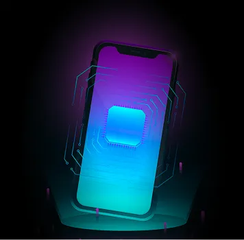
The client needed an easy app for travelers to manage eSIM. They wanted their app to be fast to use, have a clean UI, and be simple to operate. We created such an app that users can quickly browse, buy, and track eSIM plans. The app keeps travelers connected, no matter where they go. This project made digital travel simpler for everyone.
Typography & Colour
- Regular
- Medium
- Bold
-
Project Outcome
Now, AirZen works well on all devices. The look is clean and simple. Users can find, buy, and track plans in seconds. Every step is quick and easy. Clear buttons also help users take action fast. Our team presented the prototype and delivered a smooth, user-friendly app in a very short timeframe. We even provided ongoing support for the client.
-
-
LOOKING FOR A DESIGN AND DEVELOPMENT PARTNER?


