Table of Contents
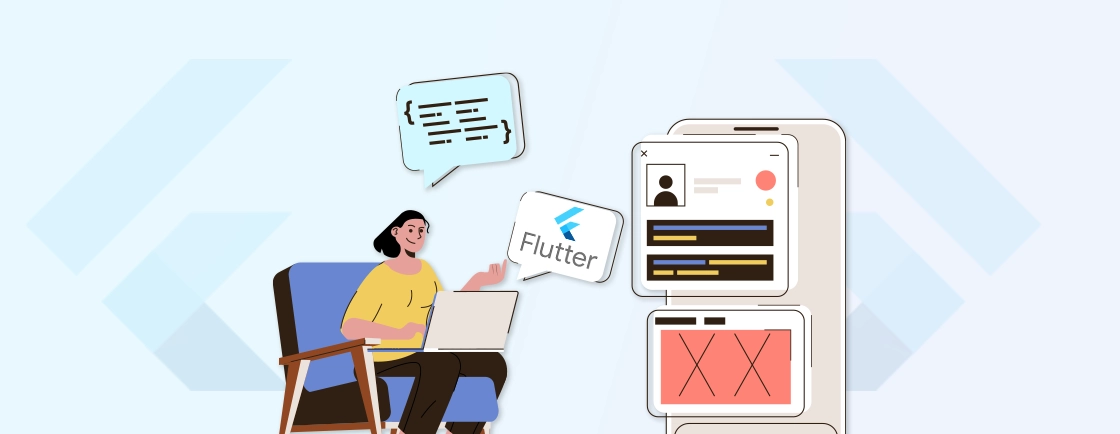
Imagine building a sleek, responsive, cross-platform mobile application without writing thousands of lines of code. Flutter widgets make this possible—these reusable UI components are the building blocks of dynamic, cross-platform apps.
Whether you’re crafting buttons, layouts, or animations, widgets simplify development while ensuring consistency and performance. Google’s Flutter framework relies heavily on widgets, so developers can create visually appealing UIs with minimal effort.
In this blog, we’ll discuss the Flutter widgets to ensure faster mobile app development at lower costs. Plus, you will see how the Flutter experts leverage them to streamline the workflow and elevate the UX. Let’s begin.
What are Widgets in Flutter?
In Flutter, widgets are the fundamental building blocks that define an app’s structure, appearance, and behavior. Think of them as reusable Lego pieces—each serving a specific purpose, from buttons and text fields to entire screens. With widgets, you can display texts, arrange elements, and handle user input with ease.
Widgets follow a composition-based approach, so complex UIs are built by nesting smaller widgets inside larger ones. Widgets are immutable–that means when there are changes in properties, rather than modifying the widgets, Flutter rebuilds updated ones.
Types of Flutter Widgets
Flutter widgets can be categorized based on their functionality and behavior. Understanding these types helps developers choose the right widget for the right task. It ensures efficient and maintainable code.
StatelessWidget
A StatelessWidget in Flutter is like a snapshot—once created, it never changes. Ideal for static UI elements (text labels, icons, or simple containers), it rebuilds only when its parent widget does. Since it has no internal state to manage, it’s lightweight and efficient.
When to use it?
- Displaying fixed content (e.g., headers, descriptions).
- UI elements that don’t react to user input or data changes.
- Optimizing performance by avoiding unnecessary rebuilds.
Example
Text(
  'Hello, Flutter!',
  style: TextStyle(fontSize: 16),
)
StatefulWidget
Unlike StatelessWidget, a StatefulWidget can update dynamically—perfect for interactive elements like forms, animations, or real-time data displays. It maintains an internal State object that triggers UI updates when modified (via setState()).
When to use it?
- Handling user input (text fields, checkboxes).
- Managing real-time data (counters, API-driven content).
- Creating animations or transitions.
class Counter extends StatefulWidget {
  @override
  _CounterState createState() => _CounterState();
}
class _CounterState extends State<Counter> {
  int _count = 0;
  void _increment() => setState(() => _count++);
  @override
  Widget build(BuildContext context) {
    return ElevatedButton(
      onPressed: _increment,
      child: Text('Count: $_count'),
    );
  }
}
With these widgets, developers can build responsive, visually appealing, and high-performance Flutter applications with ease.
Best Widgets for Flutter Applications
Flutter offers a rich widget library developers can use to build beautiful, responsive, and high-performance apps with ease. Whether you’re designing layouts, handling user input, or optimizing performance, it’s important to choose the right widget.
Here are a few powerful and commonly-used ones.
Layout & Structure Widgets
Container
The Container widget is Flutter’s Swiss Army knife. It’s a box that can hold padding, margins, borders, and decorations while controlling size and alignment. Developers use it to wrap other widgets for styling or as a blank canvas for custom designs.
Container(
  padding: EdgeInsets.all(16),
  color: Colors.blue,
  child: Text('Hello, Container!'),
)
Row & Column
Row and Column arrange child widgets horizontally and vertically, respectively. They use mainAxisAlignment and crossAxisAlignment to control spacing and alignment, making them essential for structured layouts.
Row(
  mainAxisAlignment: MainAxisAlignment.spaceEvenly,
  children: [Icon(Icons.star), Text('5 Stars')],
)
ListView & GridView
ListView displays items linearly (great for lists), while GridView lays them out in a grid (ideal for galleries). Both support lazy loading for performance. You can use ListView.builder for dynamic lists to avoid rendering off-screen items.
ListView(
  children: [ListTile(title: Text('Item 1')), ListTile(title: Text('Item 2'))],
)
Stack
Stack overlays widgets (like Positioned or Align) for custom UIs—think avatars with badges or floating action buttons.
Stack(
  children: [
    Image.network('url'),
    Positioned(bottom: 0, child: Text('Overlay')),
  ],
)
Expanded & Flexible
Expanded fills available space in Row/Column, while Flexible offers more control with flex ratios. Perfect for responsive layouts.
Row(
  children: [
    Expanded(child: Container(color: Colors.red)), // Takes 2/3 space
    Flexible(flex: 1, child: Container(color: Colors.blue)),
  ],
)
Interactive Widgets
ElevatedButton & TextButton
ElevatedButton (material-style) and TextButton (minimalist) handle user taps. Customize with onPressed and style.
ElevatedButton(
  onPressed: () => print('Clicked'),
  child: Text('Submit'),
)
TextField
Capture text input with TextField. Add controllers, validation, and decorations like hint text or borders.
TextField(
  decoration: InputDecoration(labelText: 'Username'),
  onChanged: (text) => print(text),
)
Checkbox & Radio
Checkbox (multiple selections) and Radio (single choice) work with bool or enum values. Wrap in ListTile for better UX.
Checkbox(
  value: _isChecked,
  onChanged: (bool? val) => setState(() => _isChecked = val!),
)
Slider & Switch
Slider selects a range (e.g., volume), while Switch toggles a boolean state (e.g., dark mode).
Switch(
  value: _isDarkMode,
  onChanged: (val) => setState(() => _isDarkMode = val),
)
Visual & Theming Widgets
Text & Icon
Text displays styled strings, and Icon shows material/custom icons. Combine them for rich labels.
Row(
  children: [Icon(Icons.email), Text('user@example.com')],
)
Card
Card groups content with elevation (shadow) and rounded corners. Great for profiles or tiles.
Card(
  child: Padding(
    padding: EdgeInsets.all(16),
    child: Text('Card Content'),
  ),
)
AppBar & BottomNavigationBar
AppBar (top toolbar) and BottomNavigationBar (tab navigation) structure app flow. Customize titles, actions, and icons.
AppBar(
  title: Text('Home'),
  actions: [IconButton(icon: Icon(Icons.search), onPressed: () {})],
)
Performance-optimized Widgets
FutureBuilder & StreamBuilder
FutureBuilder handles one-time async operations (e.g., APIs), while StreamBuilder updates with real-time data (e.g., Firebase).
FutureBuilder<String>(
  future: _fetchData(),
  builder: (context, snapshot) => Text(snapshot.data ?? 'Loading...'),
)
AnimatedContainer & Hero
AnimatedContainer auto-animates property changes (e.g., size/color). Hero creates shared-element transitions between screens.
AnimatedContainer(
  duration: Duration(seconds: 1),
  width: _isExpanded ? 200 : 100,
)
ListView.builder
ListView.builder renders items on-demand, saving memory for long lists. Define an itemBuilder and itemCount.
ListView.builder(
  itemCount: 100,
  itemBuilder: (context, index) => ListTile(title: Text('Item $index')),
)
Platform-specific Widgets
CupertinoButton
CupertinoButton mimics iOS design with crisp edges and system colors. Use for cross-platform apps.
CupertinoButton(
  child: Text('iOS Button'),
  onPressed: () {}
)
MaterialApp
MaterialApp initializes your app with material design, themes, and navigation. The root of every Flutter project.
MaterialApp(
  home: Scaffold(appBar: AppBar(title: Text('Home'))),
)
Each widget serves a unique role and it’s important to use them wisely. So for the best results, you can hire Flutter app developer.
Best Practices for Flutter Widgets
Flutter’s widget-based architecture offers incredible flexibility. But following best practices ensures your app remains performant, maintainable, and scalable.
Keep Widgets Small & Single-Purpose
Break complex UIs into small, reusable widgets. Each should handle one task—like a button or text field. This improves readability, testing, and maintenance. Large widgets slow performance and complicate debugging. Think modular for cleaner code.
Prefer StatelessWidget When Possible
Use StatelessWidget for static UI elements. It’s lightweight and rebuilds only when the parent changes. Avoid unnecessary state management overhead. Reserve StatefulWidget for dynamic content like forms or animations.
Use const Constructors
Mark widgets as const when properties won’t change. This helps Flutter skip redundant rebuilds, boosting performance. Ideal for static widgets like Text or Icon.
Optimize List Rendering
For long lists, use ListView.builder or GridView.builder. They render items on-demand, reducing memory usage. Avoid List.generate for large datasets—it builds all items upfront.
Leverage Keys Wisely
Keys help Flutter identify widgets during updates. Use ValueKey for unique items in lists. Overusing keys adds complexity; apply them only when necessary for state preservation.
Minimize setState() Calls
Limit setState() to essential UI updates. Frequent calls trigger rebuilds, hurting performance. For complex state, consider Provider or Bloc to manage changes efficiently.
Use Expanded and Flexible for Responsive Layouts
These widgets distribute space dynamically in Row/Column. Expanded fills remaining space, while Flexible allows ratio-based sizing. Perfect for adaptable UIs across devices.
Decouple Business Logic from UI
Separate logic from widgets using state management (e.g., Provider, Riverpod). This makes code testable and reusable. Widgets should focus on rendering, not data processing.
Test Widgets in Isolation
Write widget tests using flutter_test. Verify behavior without relying on parent widgets. Mock dependencies to ensure tests run fast and predictably.
Profile Performance
Use Flutter’s DevTools to identify bottlenecks. Track widget rebuilds, GPU usage, and frame rates. Optimize heavy operations like animations or large lists.
Flutter’s widget system thrives on composition. Combine simple widgets to build complex UIs for high-quality mobile applications.
Let’s Summarize
Widgets are the heartbeat of Flutter—transforming code into beautiful, responsive interfaces with remarkable efficiency. Are you building a simple button or a complex animated layout? Then Flutter widgets have you covered.
Flutter widgets can help create apps that are not just functional but delightful to use. The right widget choices lead to cleaner code, smoother performance, and a maintainable codebase. What you want to do is start small and iterate with new functionalities.
And if you need help with building the best widgets for your mobile app, consult a professional flutter application development company
FAQs on Flutter Widgets
What’s the best way to handle lists efficiently?
Use ListView.builder or GridView.builder for lazy loading. Avoid ListView(children: []) for large datasets.
Can I reuse widgets across projects?
Yes! Extract widgets into separate files for easy reuse. Libraries like flutter_hooks can further enhance reusability.
Why does Flutter use immutable widgets?
Immutable widgets ensure consistency and performance. Instead of modifying existing widgets, Flutter creates new instances when changes occur. That makes UI updates predictable and efficient.
How do themes work with widgets?
Themes (ThemeData) provide consistent styling across widgets. They define colors, fonts, and shapes, which widgets like Text and AppBar automatically inherit unless overridden.
What’s the difference between SizedBox and Container?
SizedBox is a lightweight box with fixed dimensions, while Container supports additional features like padding, margins, and decorations. Use SizedBox for simple spacing.

Accelerate Development with Flutter
Build high-performance mobile, web, and desktop experiences from one unified Flutter codebase.
