Table of Contents
As a site owner, you know how crucial it is to make navigation easy for visitors. One way to enhance their experience is by implementing a sticky menu or header. This keeps the main navigation visible at all times, no matter how far someone scrolls down the page. It improves the user experience and makes visitors more likely to explore more of your content without feeling lost.
In this post, we’ll walk you through how to create a sticky menu or header in WordPress. Whether you’re looking for a simple plugin solution or want to go the custom route, we’ll cover everything and best practices to follow when developing sticky headers. Let’s dive in!
What is a Sticky Menu/Header?

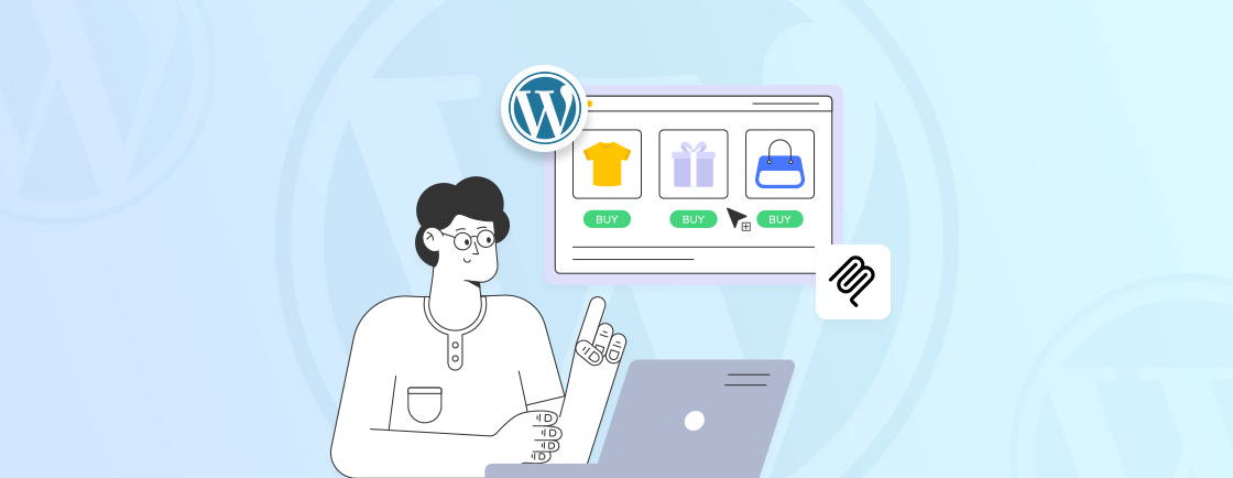
A sticky menu, also known as a fixed header, is a navigation bar that stays pinned to the top of your website as users scroll down the page. No matter where someone is on your site, the menu remains visible, allowing them to quickly access key sections without the hassle of scrolling back to the top.
This feature makes navigation much easier and enhances the user experience. For example, if a visitor is browsing a long page and suddenly wants to check out your services or contact information, they can do so right from the sticky menu. It saves time and ensures important links are always within reach.
Why Add a Sticky Menu to Your Website?
Adding a sticky menu to your website is all about improving the user experience. When visitors can easily navigate your site without getting lost, they’re more likely to stay longer, explore more content, and even take action—like contacting you or making a purchase.
For WordPress site owners, this is especially valuable. Whether you run a blog, an online store, or a business website, a sticky menu makes it simple for users to find what they need, leading to higher conversions and lower bounce rates.
Beyond just easy navigation, a sticky menu also offers these benefits:
- Increases conversion rates by keeping important CTA buttons (like “Contact Us”) visible.
- Encourages deeper site navigation by keeping essential links always accessible.
- Improves dwell time, which is great for SEO, by making it easy for visitors to find more content.
- Boosts brand recognition by keeping your logo in constant view.
Plus, you can create sticky menus for both primary and secondary navigation, so your visitors have everything they need at their fingertips, no matter how they explore your site.
How to Create a WordPress Sticky Menu/Header
Creating a sticky menu or header in WordPress enhances the user experience by keeping important navigation elements visible as users scroll through your website. There are four main ways to implement this feature, each with its own benefits depending on your website’s setup. Let’s dive into the details.
Option 1: Create a Sticky Header Using a Compatible Theme
The quickest and easiest solution to create a sticky header may already be built into your theme. Many WordPress themes offer a built-in sticky menu or header feature, saving you the trouble of using extra plugins or custom coding. For example, if your header includes multiple navigation levels, you may also use elements like a dropdown menu in WordPress to organize items better.
Here are some popular themes that include sticky header functionality:
- Astra: Astra’s Pro version includes a “Sticky Header” module, allowing you to make the header sticky with just a few clicks.
- GeneratePress: In the premium version, you’ll find the “Menu Plus” module, which allows for a sticky menu or header.
- Blocksy: If you use Blocksy Pro, the Header Builder feature includes a sticky option that can be customized as needed.
These themes make it easy to add sticky headers or menus, but note that these options are generally only available in the premium versions. If you’re not ready to invest in a paid theme, you may still find some free themes that offer sticky header functionality—just make sure to explore your theme’s settings or check the theme’s documentation.
Option 2: Create a Sticky Header With a Plugin
If your theme doesn’t support a sticky header by default, don’t worry. The Sticky Menu & Sticky Header plugin is a powerful and flexible tool that can help you create sticky elements regardless of your theme. This plugin allows you to make various elements on your website sticky, such as:
- The menu or header at the top of the page: This is perfect for keeping navigation always accessible.
- Widgets in the sidebar: You can make calls to action or keep important information visible in your sidebar.
- Sticky footer elements: Great for keeping social media buttons or other important links fixed at the bottom of the page.
How to Configure the Plugin
Once you’ve downloaded and activated the plugin, follow these steps to configure it:
- Navigate to Settings > Sticky Menu (or Anything!) in your WordPress dashboard.
- Choose the element you want to make sticky by finding its ID or class. To do this:
- Open your website’s page in a browser.
- Right-click the element (e.g., the navigation menu) and select Inspect.
- The relevant HTML code will be highlighted. Look for the ID or class, which might look like this: <nav id=”navbar” class=”container”>.
- Copy the ID (e.g., navbar) and paste it into the Sticky Element field in the plugin settings. Be sure to add a hashtag before the ID so it looks like the #navbar.
- Save the settings.
This method is quick and simple, but requires some basic understanding of HTML. However, even beginners can manage this with minimal effort, especially by using browser inspection tools to find the necessary element ID or class.
Adjusting Position and Spacing
By default, the sticky menu or header will be positioned at the very top of the page, but you can modify this. For example, if you want to leave some space between the sticky element and the top of the screen, add a margin. This is especially useful if you have other elements, such as an admin bar, that may overlap with the sticky header.
Responsive Settings
For a better user experience across devices, you can set specific breakpoints to control how the sticky element behaves on different screen sizes. For example:
- You can choose to disable the sticky header on smaller devices, such as smartphones, by setting a pixel breakpoint.
- Or, you may want to enable the sticky header only on larger screens, keeping it hidden on mobile devices where screen space is limited.
These adjustments ensure that your sticky menu works seamlessly across different screen sizes, improving usability on mobile devices.
Advanced Plugin Configuration Settings
For those who want more control over the sticky element, the plugin offers several advanced settings to fine-tune its behavior:
- Z-Index: The Z-index controls the stacking order of elements on a webpage. If your sticky header appears behind other elements, increasing the Z-index (e.g., 1000) will bring it to the forefront. This ensures that your sticky header remains visible and accessible above other layers on the page.
- Push-up Elements: The Push-up Elements option allows you to hide the sticky header when a certain point on the page is reached, such as when the user scrolls to the footer. This is useful if you don’t want the sticky element to overlap with important content in the footer or other sections of the page.
- Legacy Mode: The Legacy Mode is an option you should only use if you’re working with an older version of the plugin or a theme that requires backward compatibility. If you’re using a newer theme and the latest plugin version, you won’t need to worry about this setting.
- Debug Mode: If your sticky header isn’t behaving as expected (e.g., not appearing or not sticking), you can activate Debug mode to troubleshoot issues with the selectors. This helps identify any potential conflicts between the sticky element and your theme’s existing CSS or layout structure.
If you’re looking for more flexibility or want to avoid using plugins, there are two additional methods to create a sticky menu or header in WordPress: using custom CSS or a page builder. These methods provide more control over the design and functionality of your sticky header.
Option 3: Create a Sticky Header Using CSS
For more advanced users who prefer not to rely on plugins, creating a sticky header using custom CSS is a powerful option. This method gives you full control over the look and behavior of your sticky header.
Here’s how you can manually create a sticky header using CSS:
- In the WordPress admin dashboard, navigate to Appearance → Customize.
- In the Customizer, locate the Additional CSS tab where you can input custom CSS code.
- Enter the following code into the CSS box:
#site-navigation {
    background: #00000; /* Change the hex code to customize the background color */
    height: 60px; /* Adjust the height as needed */
    z-index: 170; /* Ensure the header appears above other elements */
    margin: 0 auto;
    border-bottom: 1px solid #dadada; /* Optional bottom border */
    width: 100%;
    position: fixed; /* Makes the header sticky */
    top: 0;
    left: 0;
    right: 0;
    text-align: center;
}
In this code, you’ll need to replace #site-navigation with the actual CSS class or ID for your website’s header. You can find this by using your browser’s Inspect tool, just as you would with the plugin method.
You can further customize the header by changing the background color (with a different hex code), adjusting the height, width, and other display properties like padding or text alignment.
After customizing the code, click Publish to apply your sticky header across your website.
This method is ideal for users who want more control over the design of their sticky menu or are comfortable editing CSS directly. Additionally, it reduces the reliance on third-party plugins, which can help keep your site’s performance optimized.
Option 4: Create a Sticky Header With a Page Builder
If you prefer a more visual, code-free approach, page builders offer an excellent solution. With drag-and-drop functionality, these tools allow you to create complex layouts, including sticky headers, without writing any code.
One of the most popular page builders that offers sticky header functionality is Elementor. Here’s how you can use it:
- First, install the Elementor Pro plugin. The Pro version includes the sticky header feature, which isn’t available in the free version.
- Go to Templates → Theme Builder in your WordPress dashboard.
- Choose Header and either create a new template or edit an existing one.
- In the Elementor editor, click on the header section you want to make sticky.
- Go to the Advanced tab.
- Under Motion Effects, toggle on the Sticky option.
- Choose where the header should stick (top, bottom, etc.) and on which devices (desktop, tablet, or mobile).
- Elementor Pro allows you to fine-tune the sticky behavior, such as adding custom CSS for more detailed styling or adjusting visibility for different screen sizes.
- After completing your design, click Publish to make your sticky header live on the site.
Using a page builder like Elementor Pro makes the process extremely easy, especially for non-developers. You can create a sticky header without touching a single line of code, and the drag-and-drop editor allows for real-time customization, giving you full creative freedom. And if you want a seamless, high-performing sticky header tailored to your brand, work with a WordPress development company to design, customize, and optimize your website for better usability and conversions.
Best Practices for Creating a WordPress Sticky Menu/Header
Your sticky menu should enhance the user experience, making your site easier to navigate and not more complicated. Here are some best practices to ensure your sticky menu or header works seamlessly and boosts engagement on your website.
Tailor Your Menu Colors for Brand Identity
Your sticky menu should maintain consistency with your website’s overall design. To make sure users engage with your navigation, use colors that are inviting but still aligned with your branding.
For example, if your site features a lot of transparency, you could set the sticky header to have a transparent background and use contrasting colors for the links.
How to customize sticky menu colors:
- Go to Appearance → Customize in your WordPress dashboard.
- Click on Additional CSS and enter the following code:
nav {
    background: rgba(0,0,0,0); /* Transparent background */
    transition: background .5s;
}
nav:hover {
    background: #ffffff; /* Solid background on hover */
}
Replace the nav with your specific header’s CSS ID or class. Adjust the background color to fit your branding.
Include Your Brand Logo in the Menu
Including your brand’s logo in the sticky menu keeps your business top-of-mind as visitors navigate through your site. This is especially important for brand recognition and establishing trust with your users.
How to add a logo to your sticky header:
- Go to Appearance → Customize in your WordPress dashboard.
- Click on Theme Options and select Site Identity.
- Upload your logo and adjust its size. We recommend using a logo smaller than 100px by 100px to ensure it doesn’t take up too much space or hang over the edges of the sticky header.
Only Add the Most Useful Menu Items
To avoid clutter, only include the most essential items in your sticky menu. Focus on what your visitors need the most. For example:
- eCommerce sites: Include links like Categories, Sale, Account, and a shopping cart button. These elements rely heavily on an organized navigation menu in WordPress to help users browse products smoothly.
- Business sites: You might include links to Home, About, Services, Blog, and a Call to Action button like Contact Us.
- Freelancer sites: A typical sticky menu might include Home, Portfolio, Blog, and a CTA like Schedule a Consultation.
Create a Custom Sticky Menu for Mobile Browsers
Designing for mobile devices requires a slightly different approach since you have less screen space to work with. Consider creating a simplified version of your sticky menu for smaller screens:
- Reduce the number of menu items or font size for mobile screens.
- Hide the sticky header when users scroll down and only show it when they scroll back up, optimizing space and reducing distraction.
Most page builders and themes will allow you to make these adjustments directly within their mobile settings.
Use a Magnifying Glass Icon for Search Functionality
Maximizing the space in your sticky menu is essential. Instead of using a search text field, use a magnifying glass icon that users can click to access search functionality. This keeps your menu minimal and user-friendly while still providing access to search.
Add a Hover Animation to Your Sticky Menu
Adding subtle animations can enhance the user experience. For instance, you could have your sticky header be transparent when the page loads and change to a solid color when the user hovers over it. This makes the menu discreet yet easy to interact with. You can also enhance navigation by using features like anchor links in WordPress for smoother movement between sections.
How to add a hover animation using CSS:
- Go to Appearance → Customize in your WordPress dashboard.
- Click on Additional CSS and add this code:
nav {
    background: rgba(0,0,0,0); /* Transparent background */
    transition: background .5s;
}
nav:hover {
    background: #ffffff; /* Solid background on hover */
}
Customize the colors as per your preference. If changes don’t appear immediately, clear your browser’s cache or use the !important tag in your CSS.
A/B Test Your Sticky Menu
Test different versions of your sticky menu to see which one performs best. You can try different colors, layouts, or menu items and use an A/B testing plugin to see which variation users respond to more positively.
If you don’t want to run formal split tests, you can experiment by pushing a version live and then analyzing key metrics like clicks on your CTA or bounce rate. Based on the results, make small tweaks to optimize the sticky menu for user engagement.
Enhance Your Site Navigation with WordPress Sticky Menu
A well-crafted sticky menu can make all the difference in how users navigate your WordPress site. By keeping key elements like your navigation links or a call-to-action always visible, you improve accessibility and ensure users never get lost while browsing.
By following these best practices, your sticky header will not only look great but also work effectively to guide users through your site, keeping them engaged and improving the overall usability. It’s a small change that can lead to big improvements in user satisfaction and conversions.
Whether you chose a theme with built-in sticky functionality, relied on a plugin, or customized it through CSS, you now have the tools to create a seamless experience for your visitors. If you are facing any issues, you can also hire WordPress developers to ensure the best navigation and user experience.
FAQs on How to Create a WordPress Sticky Menu/Header
How to ensure effective WordPress sticky headers?
To create an effective sticky header, make sure it’s visible without being disruptive. Keep its size appropriate to the screen resolution, and ensure it doesn’t cover too much of the page content.
How to create a custom menu in WordPress?
– Go to your WordPress Dashboard.
– Navigate to Appearance > Menus.
– Click Create a new menu at the top.
– Name your menu and click Create Menu.
How do I create a custom header widget in WordPress?
Go to Appearance » Widgets, and locate the Custom Header Widget Area. You can now add widgets to this section for further customization.

Create with WordPress CMS
Build flexible and scalable websites using WordPress's powerful content management system.