Table of Contents
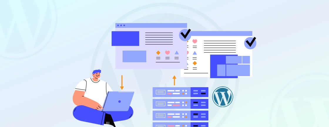
WordPress website design has been constantly evolving, and so are the tools at your disposal to craft an unforgettable online experience. Now, designers can shift a website from the predictability of containers to the boundless creativity of columns.
While containers have long been a trusted tool in the WordPress toolbox, columns offer a dynamic and visually engaging way to present your content. So, if you convert from container to column in WordPress, your website will become more responsive, adaptive, and aesthetically pleasing.
However, converting a container layout to a column layout in WordPress can be a tricky topic for some. But this blog on the containers, columns, and the conversion process might be of help.
Let’s begin.
What are Containers & Columns in WordPress?
Before moving on to how to convert from container to column in WordPress, first, we need to see what these elements are.
Simply put, containers and columns are two fundamental layout elements used to structure and organize content on a WordPress web page and site.
Container
Typically, a container layout is the outermost element that wraps around your website’s content. They provide a bounding box for the content within, helping to control its width, alignment, and positioning on the page. Containers are often used to maintain a consistent width for the content, ensuring readability and aesthetic appeal.
Purpose: Containers help create a visually appealing and organized layout by preventing content from extending too wide across the screen, especially on larger displays. They also help center and align content, making it more readable and visually pleasing.
Usage: Containers are commonly implemented using HTML elements like ‘<div>’ or ‘<section>’. In WordPress, themes often include container styles that define the maximum width and margins for the content area.
Column
A column refers to the layout structure that divides content into vertical sections. So you can showcase different content types side by side or in an organized grid. Columns help create a structured and visually engaging layout.
Purpose: Columns are used to improve content organization, readability, and aesthetics. WordPress developers use it to present information in a more visually appealing way, such as showcasing products, comparing features, or creating magazine-style layouts.
Usage: Columns can be implemented in WordPress using various methods, including:
- Gutenberg Blocks: The Gutenberg block editor provides a “Columns” block that allows you to easily create columns within your content.
- Page Builders: Many WordPress themes are compatible with a page builder plugin like Beaver Builder, Elementor, Divi, etc. Comparing Gutenberg editor with page builders, the latter offers intuitive drag-and-drop interfaces for creating complex layouts with columns and rows.
- Custom CSS: Advanced users can create custom CSS styles to define columns within their content by setting width, positioning, and other properties.
While containers set the boundaries and provide structure for your content, columns take that structure to the next level by enhancing the user experience. That makes your website more engaging and helpful in conveying information effectively. In the next section, we’ll see why you may look to convert from a container to a column layout in your WordPress website.
Why Convert a Container Layout to a Column in WordPress?
Converting from a container layout to a column layout in WordPress can offer several benefits, depending on your specific website goals and design preferences. Here are some reasons why you might consider making this conversion:
Improved Readability: Columns can enhance the readability of your content by splitting it into smaller, more manageable sections. Shorter text lines are easier to read, and columns help achieve this without requiring visitors to scroll through long paragraphs.
Visual Appeal: Column layouts often look more visually appealing and engaging compared to single-column layouts. They create a sense of structure and hierarchy, so it’s easier for visitors to navigate and understand your content.
Content Organization: Columns provide a structured way to organize your content. You can use columns to present related information side by side or in a grid. So the users can easily compare, contrast, or access specific details.
Highlighting Key Information: Columns allow you to emphasize certain content elements by placing them in a prominent position within the layout. It’s useful for showcasing important product features, testimonials, calls to action, or featured articles.
Responsive Design: Many column-based layouts are designed to be responsive. That means they adapt to different screen sizes and devices more effectively. That ensures your website remains user-friendly and visually appealing on different devices.
Versatility: Columns offer design versatility. You can create a range of layouts, from simple two-column designs to more complex grids, depending on your content and goals. This versatility allows you to tailor your website’s presentation to different types of content.
Modern Aesthetics: Column layouts are commonly associated with modern web design aesthetics. If you want your website to have a contemporary look and feel, transitioning to a column-based layout can be of help.
Better Content Structure: Columns can help you structure your content in a more organized and logical manner. Whether you’re designing a portfolio, a product catalog, or a blog, columns enable you to present content in a way that aligns with your page and site’s purpose.
User Engagement: An attractive, well-organized layout can increase user engagement. Visitors will more likely stay on your site, explore your content, and take desired actions when the design is more visually appealing and the content is presented effectively.
Competitive Edge: A well-designed website can set you apart from competitors. If your competitors are using column layouts to their advantage, adopting a similar approach can help you stay competitive in your niche.
When converting from a container layout to a column layout in WordPress, you must assess your website’s specific needs, your target audience, and your content strategy. By doing so, you can make an informed decision about whether the switch is beneficial for your website and its overall user experience.
How to Convert From Container to Column in WordPress?
Converting a container to column layout in WordPress websites is not complex when you have the right tools and a well-laid-out plan. So here are the 9 steps on converting from container to column in WordPress.
#1. Backup your WordPress Website
When we talk about how to convert from container to column WordPress, the first step is backing up your website before implementing any major changes to it. Backups protect your website’s content, images, posts, pages, and other media files from potential loss due to several issues. That includes technical issues, human errors, hacking, or malware attacks. With backups, you can recover your website to a previous, fully functional state if anything goes wrong during updates, changes, or modifications.
WordPress hosting providers offer cPanel or similar control panels, where you can typically find a backup tool. It helps you perform full or partial backups, depending on your needs. There’s also WordPress backup plugins, like UpdraftPlus, that allow you to schedule automated backups. So you can store them on your server or in external cloud storage like Google Drive.
WordPress experts set the backup frequency to daily, weekly, or monthly based on the types of changes and size of the website. Backing up your website is a fundamental and proactive measure before converting a container to a column layout in WordPress.
#2. Choose a Theme or Page Builder with a Column Feature
When we discuss how to convert from container to column WordPress, there are two ways forward. First, the WordPress themes, and second, the page builder plugins.
Begin by exploring the wide array of themes available in the WordPress theme repository. Look for themes that explicitly mention support for columns or grid layouts in their features or descriptions. The factors to keep in mind during the conversion process are responsive design, compatibility, and customizability (to control typography, column widths, and more).
After choosing the best option, you can move on to installing the WordPress theme to convert the containers to columns on WordPress.
Or you may opt for a page builder plugin known for its column layout capabilities. Popular options include Elementor, Beaver Builder, Divi, and more. Choose between them based on the ease of use (aligning with your skill level), column elements, and compatibility.
Overall, the key is to choose a theme or page builder that aligns with your design goals, skill level, and content needs.
#3. Install & Activate the WordPress Theme or Page Builder Plugin
After choosing the WordPress theme or page builder, the next step would be to install and activate them on your website. This step sets the foundation for your design changes related to the conversion of container to column layouts.
Let’s discuss how you can install the theme or page builder plugin:
Step 1: Log into the WordPress Admin Dashboard through administrator-level access to install and activate themes or plugins.
Step 2: Install the WordPress theme or page builder plugin.
For WordPress Theme:
- Access the Theme Directory via the “Appearance” section of the dashboard.
- Go to “Add New” and search for a suitable WordPress theme on the official repository. You can also upload a custom theme through its .zip format file.
- After selecting your desired theme, click the “Install” button. Once the installation is complete, click “Activate” to set it as your active theme.
For Page Builder Plugin:
- If you’re using a page builder plugin to create column layouts, go to “Plugins”→ “Add New” in the WordPress dashboard.
- In the search bar, enter the name of the page builder plugin you want to use (e.g., Elementor).
- Click “Install Now” next to the plugin, and once it’s installed, click the “Activate” button to enable its functionality.
Step 3: Depending on the theme or page builder you’ve installed, there may be setup instructions or a welcome wizard to help you get started. Follow them properly.
Step 4: Ensure that the theme and the page builder, if used together, are compatible. Compatibility issues can sometimes arise, so it’s essential to check if they work seamlessly with each other.
Step 5: Familiarize yourself with the documentation and tutorials offered by the theme or plugin.
Now, you can start creating your column-based layout.
#4. Select the Container
When creating WordPress pages or posts, it’s important to select a container to set boundaries for your content. Now, if you want to convert to a column-based layout, you’ll have to select the container.
Here’s how you do it.
Step 1: Log into your WordPress dashboard.
Step 2: Go to “Pages” or “Posts” and navigate to the page or post where you want to implement the column layout.
Step 3: Open the page for editing and identify the content area where you will create your column-based layout.
Step 4: Now, you can either create new content within the container or rearrange existing content into columns.
The container serves as the outermost element that contains your content. When converting to a column layout, you’ll often work within this container to structure your content.
Step 5: If you’re using the block editor (Gutenberg), you can insert a block that supports columns.
You’ll typically find a “Columns” block or similar options in the block inserter. Place this block within the content area where you want your columns to appear.
#5. Open Block Settings
In this part of the process, you will need to access the settings and options related to the block you’ve chosen for creating columns.
If your website is using Gutenberg as the default editor, your page or post will automatically open in this editor. The block editor is designed to provide a visual and modular approach to content creation. Within the block editor, you need to insert a block that supports columns. To do this, click the “+” icon (or “Add Block” button) to access the block inserter tool.
In the block inserter, you can search for a block related to columns. This block is typically called “Columns” or similar. You can also scroll through the available block categories to find it.
Click inside the columns block to place your cursor within it. This action indicates that you’re now working within the columns block. To access the block settings for the columns block, look for a toolbar or sidebar panel on the right side of the editor. In this panel, you should see options related to the block you’re currently working with. These options include the number of columns, column width settings, and other customization features.
#6. Choose the Column Layout & Adjust Column Widths
Inside the block settings, you can make several adjustments to configure your column layout according to your preferences:
Number of Columns: Choose the number of columns you want to create within the block. Common options include 2, 3, or more columns.
Column Width: Adjust the width of each column. Some blocks allow you to specify column widths as percentages.
Alignment: Set the alignment of the columns within the block, such as left, center, or right alignment.
Gap: Specify the spacing or gap between columns, ensuring a visually appealing design.
#7. Add and Rearrange the Content to Columns
Now, on to a fundamental step in converting from container to column layout in WordPress. It involves placing and organizing various content elements (such as text, images, or widgets) within the columns you’ve created.
Here’s how you do it:
Step 1: If you’re using the Gutenberg block editor, insert the “Columns” block into your content area as explained earlier.
Step 2: Inside the “Columns” block, make sure the number of columns and their respective widths match your design preferences.
Step 3: Click inside each column to place your cursor. Now, you can add content elements to each column. There are several options to choose from:
- Text: You can just start typing to add text content directly. You can format the text, add headings, and apply styles using the block editor’s formatting options.
- Images: Adding images to the column is relatively easy using the “Image” block. You can either upload images from your computer or select them from your media library.
- Videos: For videos, you can use the “Video” block. You can embed videos from popular platforms like YouTube or Vimeo.
- Widgets: Some column blocks support the inclusion of widgets. You can add widgets like recent posts, categories, or custom HTML to display dynamic content.
- Custom Blocks: Depending on your setup, you might have custom blocks or plugins that offer specialized content elements. These can be added to your columns as needed.
Step 4: Next, you will have to rearrange content elements within columns using the drag-and-drop functionality of the block. So you can just hold down the mouse click and drag the content element to a new position. That is either within the same column or to a different column.
Adding and rearranging content within columns is where you have the creative freedom to craft engaging and visually appealing layouts. On a particular topic, your content may be similar to others, but how you present it is what makes it unique. That’s where the experience and expertise of hire SEO experts come forth. With customer interaction in mind, they know what type of content should be placed and where.
#8. Preview the Design & Test Responsiveness
We’re almost at the end of converting a WordPress container to a column layout. In this part of the process, you need to preview the new column-based design. You have to make sure it looks appealing and functions well across various devices and screen sizes.
Step 1: First, check if the newly added and arranged content within the columns are as you had intended. See if there are any potential issues with content placement, alignment, spacing, or something else.
Step 2: If you’re using the block editor, click on the “Preview” button near the top-right corner to preview your page. That will open a browser (likely your default one) and show how your page will look when published.
Step 3: During the preview, first check the desktop view and ensure the columns are rendering as expected. Also, see if there are any issues with fonts, images, or other elements.
Step 4: Responsiveness is critical, as it ensures that your column layout adapts seamlessly to different devices, including mobile phones and tablets. So, test the page responsiveness.
- Resize Your Browser Window: First, resize your browser window to a narrower width to simulate a smaller screen size. The newer OSs have options to split the screen into different sizes. So you can see how your layout responds to different screen widths.
- Mobile and Tablet Views: Next, check how your columns appear on mobile and tablet devices. You can use your browser’s developer tools to simulate different screen sizes or access your website on actual mobile devices by sharing the page. This helps you evaluate how well your layout adapts and ensures your WordPress site is mobile-friendly, providing a more accurate assessment of the real user experience.
During the responsiveness testing, WordPress programmers pay close attention to the following aspects:
- Content Stacking: Ensure that columns stack vertically when viewed on smaller screens. That means if you had, for example, two columns side by side on a desktop, they should become stacked on top of each other on mobile.
- Font Size and Readability: Check that your text remains readable and legible on smaller screens. Adjust font sizes and line spacing if necessary.
- Images and Media: Verify that images and media elements scale appropriately and maintain their aspect ratios. They should not appear cropped or distorted.
- Navigation: If you have a navigation menu, test its functionality and appearance on smaller screens. Ensure that it’s easily accessible and user-friendly.
Step 5: If you identify any issues with any of these elements, make adjustments to your column layout. These adjustments may include just tweaking the column widths and adjusting the margins and padding or overhauling the responsive design techniques.
Repeat these steps until you have ensured there are no issues with the newly converted column layouts.
#9. Save the Changes & Publish the Page
In the final part of how to convert from container to column in WordPress, we’ll take a look at saving the changes, publishing the page, and making it accessible to the public.
Step 1: After reviewing the entire column layout, look for the “Save” or “Update” button. It will help you save the changes you’ve made to your page or post.
Step 2: Then preview your page or post one last time to double-check that everything appears as intended before making it live on your website. Test any links, buttons, or interactive elements within your columns to ensure they function correctly.
Also, verify that navigation menus, forms, and any other website features work as expected. Pay special attention to the mobile responsiveness of your column layout during this final review.
Step 3: Address any issues or discrepancies promptly. That means text formatting making minor adjustments to column widths or other design elements.
Step 4: After you’re satisfied with the appearance and functionality of the newly converted columns, it’s time to publish the new layout. In the editor, locate and click on the “Publish” button on the top right corner of the screen.
It will publish your WordPress page or post for everyone to see. That concludes the process of how to convert from container to column in WordPress. But it’s not over yet.
Make sure you keep an eye on your website to ensure everything continues to work smoothly. Gather feedback from the users and fine-tune the layout as needed. That will help you showcase your content effectively and provide a better user experience to your website visitors.
Top Tips on WordPress Web Design
Following the above process on how to convert from container to column in WordPress will help improve your design quite significantly. But still, there are some tips you need to consider if you want the best results:
1. Prioritize user experience by organizing content by making sure the layout enhances readability and navigation for your visitors.
2. Design your column layout with a mobile-first approach. With mobile devices accounting for over 50% of the web traffic, the new column layout should look and function well on smaller screens.
3. Maintain design consistency throughout your website, with similar fonts, colors, and spacing for visually appealing design.
4. Use whitespace effectively to create breathing room between columns and content elements and improve readability and aesthetics.
5. Use headings, subheadings, and bullet points, and structure your content within the columns to make it scannable and easy to digest.
6. Optimize images and multimedia elements to ensure fast loading times.
7. Use alt text and title for images and create semantic HTML to ensure the container to column conversion complies with the accessibility standards.
8. Test your column layout in the best web browsers for WordPress to ensure they display the content consistently.
9. Encourage user feedback regarding the new column layout to identify any issues and corresponding improvements.
Along with learning how to convert from container to column in WordPress, you should also keep these top tips for WordPress web design in mind. They are among the top priorities for any professional web design company, especially when working with high-performance platforms like WordPress VIP. These tips help ensure your website not only looks and functions well but also delivers a positive user experience while adhering to industry best practices.
To Conclude
Nowadays, so many people are interested in how to convert from a container to a column layout in WordPress. That is because it can significantly elevate the visual appeal, organization, and user experience of your website. If you find the transition between layouts technically challenging, our WordPress development agency can help you restructure your site architecture for a pixel-perfect, responsive design that works on all devices.
Here’s how you can ensure a smooth conversion from container to column in WordPress:
- Take a backup of your website.
- Choose a WordPress theme or page builder plugin.
- Install & activate the chosen theme or page builder.
- Select the container.
- Open block settings.
- Choose the column layout & adjust the column width.
- Add and rearrange the content to columns.
- Preview the design & test responsiveness.
- Save the changes & publish the page
Follow this process and consider the top tips when seeking how to convert from a container to a column in WordPress. Or, you can hire dedicated WordPress developers from our team to handle the transition for you, ensuring a better look and feel for your website with a perfectly responsive and modern layout.
FAQs on How to Convert From Container to Column in WordPress
What is the difference between a container and a column layout in WordPress?
In WordPress, a container layout typically refers to a full-width or boxed layout that contains your website’s content. A column layout, on the other hand, organizes content into multiple columns within the container. That offers a more structured and visually appealing design.
Do I need coding skills to convert to a column layout in WordPress?
No, you don’t need coding skills to convert to a column layout. Many modern themes and page builders offer user-friendly, drag-and-drop interfaces. That makes it easy to create column-based layouts without coding.
Can I convert my existing WordPress website from a container to a column layout?
Yes, just choose a suitable WordPress theme or page builder plugin and follow the process mentioned above. Or you can hire an agency, and their experts will complete a site-wide conversion in no time at all.
