Table of Contents
Today is a mobile-first world. Almost anything you can think of (for tech) can be accomplished on a mobile phone. In fact, over half of all internet traffic now comes from mobile devices. That means that if your WordPress site isn’t mobile-friendly, you’ll be missing out on a huge portion of your target audience. And that is one of the common web design mistakes made by so many.
A mobile-friendly website is one that is designed to look and function well on all devices, including smartphones, tablets, and laptops. That means the text should be easy to read, the links should be easy to tap, and the website should load quickly. But how do you achieve that?
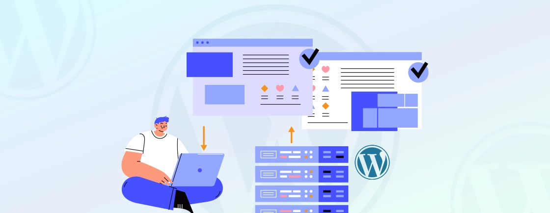
Well, in this guide, I’m going to show you how dedicated developers make the WordPress site mobile-friendly. But first, let’s see why you need to do it.
Why Make WordPress Site Mobile-friendly?
With the increasing use of smartphones and tablets, more and more people are accessing websites through their mobile devices. Let’s check out a few reasons to have your WordPress website optimized for mobile usage.
Increasing Mobile Usage
Mobile phones have now surpassed desktop usage by a wide margin, making mobile-friendly design one of the top web design trends. Its importance will only continue to grow, making it essential for businesses to adapt their online presence accordingly.
By failing to optimize your WordPress site for mobile, you’re essentially turning away a substantial portion of potential customers.
Better User Experience
A mobile-friendly website not only caters to the growing mobile audience but also significantly improves the overall user experience. When users can easily engage with your site on their mobile devices, they’re more likely to stay engaged, return for future visits, and recommend your site to others.
Conversely, a non-mobile-friendly website can lead to frustration, abandonment, and a tarnished brand image.
Better Search Engine Ranking
Search engines tend to prioritize mobile-friendly websites in their search results. That means if your site isn’t optimized for mobile, it’s less likely to appear when users search for relevant keywords or phrases.
By making your WordPress site mobile-friendly, you can boost your search rankings, attract more organic traffic, and gain a competitive edge in the eMarketplace.
Making your WordPress site mobile-friendly is not merely an option; it’s a vital step towards achieving online success in today’s mobile-first world. Mobile-friendliness will be excellent for catering to a mobile majority, enhancing user experience, and boosting your search engine ranking.
It will also seem more attractive to a wider audience, ultimately leading to increased engagement, conversions, and business growth.
How to Check if Your WordPress Site is Mobile-friendly?
Let’s say you create a high-quality website with WordPress, but it isn’t getting as much traffic as you had hoped. Then you need to check how mobile-friendly it is. Here’s how you do it.
- Verify Responsive Design: WordPress themes are designed with varying degrees of responsiveness. Check if your theme is responsive by resizing your browser window or using the browser’s developer tools to simulate different screen sizes. Ensure that the layout adapts smoothly to various screen sizes without compromising readability or functionality.
- Utilize Google’s Mobile-Friendly Test: Google offers a free tool called the Mobile-Friendly Test to assess your site’s mobile compatibility. Enter your WordPress site’s URL, and Google will analyze its layout, text size, tappable elements, and overall mobile experience. The tool provides a detailed report indicating whether your site meets mobile-friendliness standards.
- Conduct Browser Testing: There are several excellent browsers for WordPress development. Most web browsers have built-in developer tools that allow you to preview your site on various mobile devices. Access these tools by right-clicking on the page and selecting “Inspect” or “Inspect Element.” Look for the option to adjust the screen size or resolution, typically under the “Responsive” or “Device Toolbar” tab. Experiment with different devices and screen sizes to ensure your site adapts effectively.
- Evaluate User Experience: Visit your WordPress site on a variety of mobile devices like smartphones and tablets. Navigate through different pages, tap on links, and engage with interactive elements. Also, observe how the site performs in terms of ease of use, readability, and overall UX. Identify any areas where navigation or interaction becomes difficult or frustrating.
- Monitor Load Time: Mobile users expect websites to load quickly. Use a tool like Google PageSpeed Insights to measure your site’s loading speed on mobile devices. Identify any factors that might be slowing down the loading process, such as large images, excessive scripts, or unoptimized code. Optimize your site to ensure fast loading times on mobile devices.
- Assess Mobile Optimization: Review your WordPress site’s plugins and themes to ensure they are optimized for mobile devices. Check the plugin and theme documentation or contact the developers to confirm mobile compatibility. You can also use plugins that provide specific mobile optimization features, such as image optimization, mobile-specific caching, and mobile-friendly menus.
- Utilize Mobile View in WordPress Customizer: WordPress Customizer provides a mobile view option that lets you preview your site on different screen sizes. This feature is helpful for making quick adjustments to the layout and responsiveness of your site. However, it’s important to supplement this method with actual device testing to ensure optimal performance across different devices.
By following these techniques, you can effectively see how mobile-friendly the website is, and identify areas that require improvement. Remember, a mobile-friendly website is not just a technical requirement; it’s an investment in user satisfaction, search engine ranking, and business success.
How to Make a WordPress Site Mobile-Friendly?
Making your WordPress site mobile-friendly is crucial for providing a seamless UX and maintaining a competitive edge in today’s mobile-first world. By optimizing your site for mobile devices, you can ensure that your content is accessible to a wider audience, better the search engine rankings, and boost conversions.
Here’s how you do it.
Choose a Responsive WordPress Theme
A responsive WordPress theme automatically adjusts its layout to fit the screen size of the device it’s being viewed on. That means your site will look and function well on all devices like smartphones, tablets, and laptops.
When choosing a responsive WordPress theme, there are a few things to keep in mind:
- Consider the design: Look for a theme that is aesthetically captivating and aligns with your brand.
- Check responsiveness: Ensure the theme is responsive by testing it on various mobile devices and screen sizes.
- Review customization options: Look for themes that offer custom options to tailor the design to your needs.
- Check for mobile-specific features: Look for themes that offer features specifically designed for mobile devices, such as touch-friendly menus or swipeable image galleries.
- Read reviews and ratings: Research the theme’s reputation by reading reviews or ratings from other users.
Some of the most popular responsive WordPress themes are Astra, OceanWP, Neve, Storefront, and Kadence. These themes are all well-reviewed and compatible with a wide range of plugins. They also offer various customization options so that you can create a site that looks, works, and feels exactly the way you want it to.
Use Plugins to Optimize for Mobile
WordPress, the world’s most popular CMS, offers a plethora of plugins that can help you optimize your site for mobile devices. You can install WordPress plugins to address various aspects of mobile optimization, from image compression to AMP implementation.
When choosing the best WordPress plugin for your website, mobile optimization is one of the key factors to look for. But there are also some plugins that can specifically help with the mobile-friendliness of your website. Whether you’re building a business site or a WordPress personal website, here’s what you should consider.
- Your Site’s Needs: Identify the specific areas of mobile optimization that require attention, such as image optimization, AMP implementation, or responsive design.
- Features: Carefully go over the features offered by each plugin to ensure they align with your site’s needs.
- Reviews: Read reviews from other WordPress users to gauge the plugin’s performance, reliability, and ease of use.
- Compatibility: Ensure the plugins are compatible with your WordPress version, plugins, and themes.
- Support: Check the level of support offered by the plugin developer, including documentation, forums, and updates.
By carefully selecting and utilizing mobile optimization plugins, you can effectively enhance your WordPress site’s mobile experience. That will help improve user engagement and potentially boost your search engine rankings.
Use Mobile-Friendly Design Elements
By incorporating mobile-friendly design elements, you can provide a seamless and engaging user experience for your mobile audience, leading to increased engagement, conversions, and overall website success.
Here are a few key mobile-friendly design principles to consider.
- Prioritize Readability: Use a clear and legible font size that is easy to read on smaller screens. Ensure ample white space between text elements to avoid clutter and maintain visual balance.
- Emphasize Tappable Elements: Make tappable elements, such as buttons, links, and navigation menus, large enough to easily tap without accidental clicks. Consider using icons and visual cues to guide user interaction.
- Simplify Navigation: Keep your navigation menu concise and easy to navigate. Consider using a hamburger menu or accordion-style navigation for larger menus.
- Optimize Images for Mobile: Use images that are appropriately sized and optimized for mobile devices. Compress images to reduce file size without compromising quality. Consider using lazy loading to delay loading images until they are visible on the screen.
- Avoid Flash and Excessive Animations: Flash is not supported on most mobile devices, and excessive animations can slow down page loading times. Opt for simpler, more mobile-friendly design elements.
- Use Responsive Layouts: Ensure your site’s layout adapts seamlessly to different screen sizes, providing an optimal viewing experience across various mobile devices. Consider using a responsive WordPress theme or implementing responsive design techniques.
These elements will ensure your WordPress websites look, feel, and work best on mobile devices.
Test and Optimize Your Site for Mobile
To ensure that your WordPress site is mobile-friendly, follow these steps:
- Test your site’s mobile-friendliness using tools like Google’s Mobile-Friendly Test or the Mobile-Friendly Test in Google Search Console. These tools will provide insights into any issues that need to be addressed.
- Optimize your site’s loading speed by compressing images, minifying CSS JS files, and leveraging browser caching. It will improve the UX on mobile devices.
- Ensure your site’s design is responsive and adapts well to different screen sizes. Use a responsive theme that automatically adjusts the layout based on the device being used.
- Make sure that all buttons and links on your site are easily clickable and spaced properly for mobile users. This will improve navigation and reduce the chances of accidental clicks.
- Optimize your site’s content for mobile by using shorter paragraphs, concise headings, and bullet points. This will make it easier for users to consume your content on smaller screens.
By following these steps, you can test and optimize your WordPress site to ensure that it is mobile-friendly and provides a great user experience on all devices.
Google and other search engines have repeatedly emphasized the importance of mobile-friendliness as a ranking element for search results. This led to a significant shift in the web development industry, with businesses prioritizing mobile optimization. There are some additional tips followed by every WordPress development company for creating a mobile-friendly website.
Tips for Creating a Mobile-Friendly WordPress Site
From simplifying navigation to optimizing images and videos, there are several tips for improving the user experience and driving increased traffic to your site. Let’s take a look.
Simplify Navigation
Mobile users have smaller screens and limited dexterity, so it’s essential to make navigation simple and intuitive. Use a clear and concise menu with large, tapable icons or text labels. Consider using a hamburger menu or accordion-style navigation for larger menus.
Optimize Images and Videos
Images and videos can significantly impact page loading times, especially on mobile devices. Optimize images by bringing down their file size without compromising quality. Use appropriate image formats (JPEG for photos, PNG for graphics with sharp edges or transparent backgrounds), and consider using lazy loading to delay loading images until they are visible on the screen.
For videos, consider using mobile-friendly formats like MP4 or WebM, and embed videos instead of direct linking to avoid compatibility issues.
Use Mobile-Friendly Forms
Forms are an essential part of many sites, but they can be challenging to use on mobile devices. Use large, easy-to-tap form fields, clear labels, and error messages that are easy to read. Consider using auto-fill features and keyboard shortcuts to make form completion more efficient.
Prioritize Content for Mobile
Mobile users often have limited attention spans and time, so prioritize your most important content for mobile viewing. Ensure that key messages and calls to action are prominently displayed and easy to access. Use concise and easy-to-read text, and break down long blocks of text into smaller chunks.
Utilize Responsive Themes and Plugins
Choose a responsive WordPress theme that automatically adapts its layout to different screen sizes. This ensures that your WordPress site looks and functions well on all devices like smartphones, tablets, and laptops.
Additionally, consider using plugins specifically designed to enhance mobile optimization, such as image compression plugins, AMP implementation plugins, and mobile-friendly menu plugins.
Test and Refine Regularly
Mobile technology is constantly evolving, so it’s important to regularly test your site on a variety of mobile devices and operating systems. Use browser developer tools to preview your site on different screen sizes and resolutions and conduct actual device testing on a variety of smartphones and tablets.
Also, gather feedback from real users, especially those who primarily access your site from mobile devices.
By following these tips and continuously refining your mobile optimization efforts, hire WordPress experts to create a site that delivers a seamless and engaging user experience for your mobile audience.
To Conclude
Nowadays, mobile devices have become an indispensable part of our lives, making a mobile-friendly website a necessity rather than an option. By following the comprehensive strategies in this guide, you can effectively transform your WordPress site, whether on standard hosting or a high-performance platform like WordPress VIP, into a mobile-optimised space that offers a seamless and engaging user experience for your mobile audience.
Here are a few ways to make a WordPress website mobile-friendly:
- Choose a Responsive WordPress Theme
- Use Plugins to Optimize for Mobile
- Use Mobile-Friendly Design Elements
- Test and Optimize Your Site for Mobile
Looking for more information on mobile optimization? Or do you want to optimize your WordPress website for mobile-friendliness? Then consult with our experts today!
FAQs on How to Make WordPress Site Mobile-friendly
Can I use a plugin to make my WordPress site mobile-friendly?
Yes, there are many mobile-friendly plugins available for WordPress that you can use to make your site mobile-friendly. Some popular options include WPtouch, Jetpack, and WP Mobile Edition.
Do I need coding skills to make my WordPress site mobile-friendly?
No, you do not need coding skills to make your WordPress site mobile-friendly. Many user-friendly plugins and themes are available that make it easy to optimize your site for mobile viewing.
What is a responsive theme, and how does it make my WordPress site mobile-friendly?
A responsive theme automatically adjusts the layout and design of your site to fit different screen sizes, making it mobile-friendly. This means that your site will look great on all devices, including smartphones and tablets.

