
Quick Answer: Vue UI component libraries provide prebuilt components, styling systems, accessibility features, and development utilities that help developers build Vue applications faster and more consistently. In this article, we divide the best Vue UI component libraries in 2026 into four categories: Full-featured/styled, Headless/custom-design, Tailwind-oriented, and Mobile/cross-platform libraries. The right choice depends on your project’s requirements.
Introduction
Choosing a Vue UI component library can significantly reduce the time required to design and develop a modern application. The best Vue component library for your project depends on more than the number of components it provides; you also need to consider Vue 3 compatibility, accessibility, customization, performance, theming, TypeScript support, and integration with tools such as Tailwind CSS and Nuxt.
In 2026, Vue.js development company have a broad range of options, from complete UI frameworks such as Vuetify, PrimeVue, and Quasar to headless solutions such as Reka UI and Headless UI. There are also Tailwind-oriented libraries, mobile-focused options, and component systems designed specifically for enterprise applications.
This guide covers the best Vue UI component libraries in 2026, their key features, ideal use cases, and what type of project each library is best suited for. Whether you are building a SaaS dashboard, enterprise application, eCommerce website, mobile interface, or highly customized design system, this list can help you choose the right Vue component library.
Best Vue UI Component Libraries
The following are the best Vue UI component libraries in 2026 as per our research. You can also explore the supportive thread going on Reddit where users mentioned Vue UI kits/component libraries.
1. PrimeVue
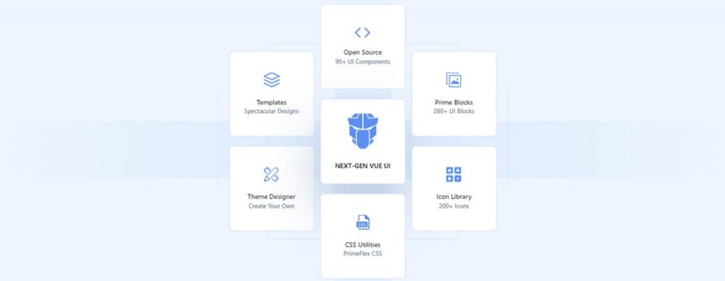
PrimeVue is a premier UI component library for Vue 3, built for complex, data-heavy, enterprise-grade applications. It strikes a perfect balance between modern functionality and styling freedom.
Key Strengths
- Massive Catalog: 90+ base UI components, ranging from simple buttons to highly advanced data tables, complex trees, and multi-step steppers.
- Unmatched Data Table: Its DataTable component is widely considered the best among Vue.js components. It handles massive datasets with built-in live scrolling, multi-column filtering, lazy-loading, and Excel-like editing.
- Flexible Styling Philosophy:
- Themed Mode: Use their built-in, polished design themes, such as Lara, Aura, or Material.
- Unstyled Mode: Strip away all default CSS and style the logic completely from scratch using Tailwind CSS, UnoCSS, or your own styles.
- Accessibility (WCAG): Components are engineered with excellent WAI-ARIA compliance to ensure your application meets strict accessibility standards.
Ideal Use Cases
- Admin Dashboard and SaaS Panels: Where complex data visualization, charts, and grids are required.
- Enterprise Software: Internal tools that require strict data validation, deep accessibility compliance, and uniform design language.
- Tailwind CSS Project: Using PrimeVue’s Tailwind pass-through features allows you to build custom design tokens while leveraging enterprise-grade component logic.
Installation
// Using NPM
npm install primevue

// Using Yarn
yarn add primevue
Example
// main.js file

import { createApp } from 'vue'
import PrimeVue from 'primevue/config'
import App from './App.vue'

const app = createApp(App)

app.use(PrimeVue)
app.mount('#app')


// App.vue file

<script setup>
import Button from 'primevue/button'
</script>

<template>
  <Button label="Submit" />
</template>
2. Vuetify 3
Vuetify 3 is a highly mature, feature-complete UI framework for Vue 3, built strictly around Google’s Material Design 3 (Material You) specifications. It offers a massive ecosystem that handles almost everything an application needs out of the box.
Key Strengths
- Material Design 3 Native: Implement the latest Google design language. This includes dynamic color generation, rounded aesthetics, and a cohesive user experience across web and mobile layouts.
- Massive Ecosystem: It goes beyond simple components. Vuetify includes a robust 12-column grid system, layout systems (v-layout, v-app-bar, v-navigation-drawer), extensive built-in directives (v-intersect, v-ripple, v-mutate), and column build tools.
- Blueprint System: Offers a layout-first architecture that allows you to easily structure the entire boilerplate of your app (headers, footers, sidebars) in minutes.
- TypeScript Support: Rewritten from the ground up in Vue 3, featuring first-class, strict TypeScript typing for every component, event, and prop.
Core Component & Features
- V-DataTable & V-DataIterator: Built-in server-side sorting, pagination, filtering, and highly customizable template slots for data-dense layouts.
- Form Validation: Seamlessly integrates with validation libraries like Vee-Validate and Yup, while offering simple :rules for rapid prototyping.
- Internationalization (i18n): Features a robust internal transaction engine to localize standard component strings easily.
Ideal Use Cases
Internal Tools: Enterprise dashboards that benefit from standard UI conventions and predictable layouts.
Google-style Apps: Projects where the Material Design aesthetics are either preferred or explicitly required.
Quick Prototyping: Ideal for small teams or solo developers who want a unified layout system, icons, and components without spending time on writing custom CSS.
Installation
// Using NPM
npm install vuetify

// Using Yarn
yarn add vuetify
Example:
// main.js file

import { createApp } from 'vue'
import 'vuetify/styles'
import { createVuetify } from 'vuetify'
import App from './App.vue'

const vuetify = createVuetify()

createApp(App)
  .use(vuetify)
  .mount('#app')


// App.vue file

<template>
  <v-btn color="primary">
    Submit
  </v-btn>
</template>
3. Quasar
Quasar is a full-featured, build-tool-driven Vue 3 framework that allows you to write code once and deploy it everywhere. While libraries like PrimeVue and Vuetify 3 offer only UI components, Quasar provides full project infrastructure to target web, mobile, and desktop simultaneously.
Key Strengths
- Reusable Code: With a single Vue 3 codebase, Quasar can build and deploy:
- SPA (Single Page Application)
- SSE (Server-side Rendering via Nuxt-like logic)
- PWA (Progressive Web Application)
- Mobile Apps (iOS and Android via Capacitor or Cordova)
- Desktop Apps (Windows, Mac, and Linux via Electron or Tauri)
- Browser Extensions (Chrome, Firefox, Safari)
- Massive UI Kit: Includes 70+ high-performance components built strictly on top of Material Design guidelines, featuring native-like transitions for iOS and Android layouts.
- Unified CLI: The Quasar CLI handles a complex compilation pipeline for Android, Studio, Xcode, and Electron so you don’t have to manage multiple build tools.
- Performance First: Features built-in, aggressive tree-shaking, and automated code splitting out of the box to guarantee fast load times regardless of the target platform.
Ideal Use Cases
- Multi-platform Startups: Teams that need to build a web app, iOS app, and Android app to production rapidly with limited engineering resources.
- Desktop Tools: Complex internal desktop software requiring native OS integration via Electron or Tauri.
- Performance-critical PWAs: Offline-first web applications targeting varying network speeds and mobile devices.
Installation
// Using NPM
npm install quasar

// Using NPM
npm install quasar
Example:
// main.js file

import { createApp } from 'vue'
import { Quasar } from 'quasar'
import 'quasar/src/css/index.sass'
import App from './App.vue'

const app = createApp(App)

app.use(Quasar)
app.mount('#app')


// App.vue file

<template>
  <q-btn color="purple" label="Purple" />
</template>
4. Element Plus
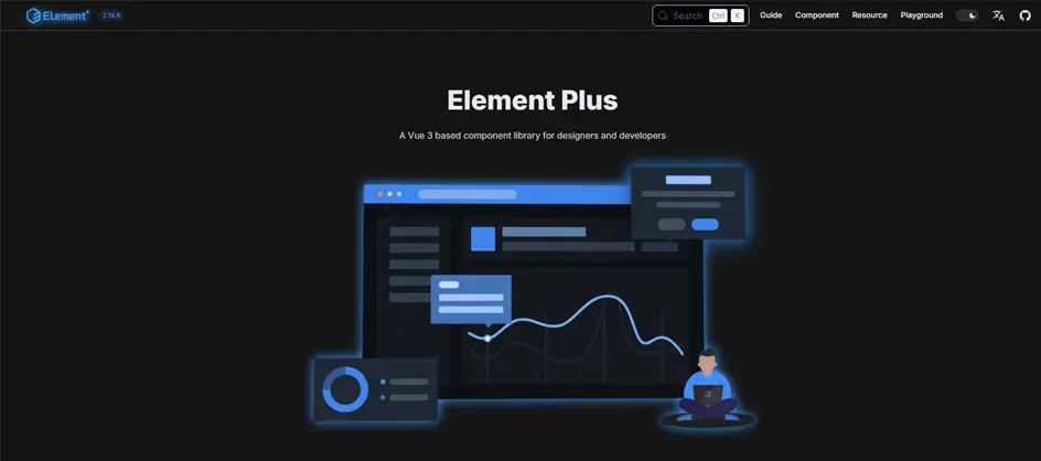
Element Plus is a TypeScript-first Vue 3 component library designed primarily for building complex enterprise dashboards and data-heavy applications.
Architecture & Design
- Vue 3 Native: Built from the ground up using Vue 3 and the Composition API to ensure fast rendering and clean code integration.
- TypeScript Support: Written completely in TypeScript, offering type definitions, reliable props validation, and rich code autocompletion in modern IDEs like VS Code.
- Minimalist Enterprise Aesthetic: Delivers a clean, uniform design language that prioritizes functional clarity over flashy visual UI elements.
Key Components
- Navigation: Supplies responsive menu bars, breadcrumbs, dropdowns, pagination controllers, and loading state masks.
- Data Display: Includes advanced tables with sorting, filtering, selection and pagination, alongside tree views, tags, badges, and timelines.
- Form Controls: Offers robust input fields, cascading selectors, color pickers, rich time/date range pickers, sliders, and form validation wrappers.
- Feedback and Overlays: Features customizable dialogue boxes, drawers, tooltips, popovers, notifications, and loading state masks.
Installation
// Using NPM
npm install element-plus

// Using Yarn
yarn add element-plus
Example:
// main.js file
import { createApp } from 'vue'
import ElementPlus from 'element-plus'
import 'element-plus/dist/index.css'
import App from './App.vue'

const app = createApp(App)

app.use(ElementPlus)
app.mount('#app')

// App.vue file

<template>
  <el-button type="primary">
    Submit
  </el-button>
</template>
5. Naive UI
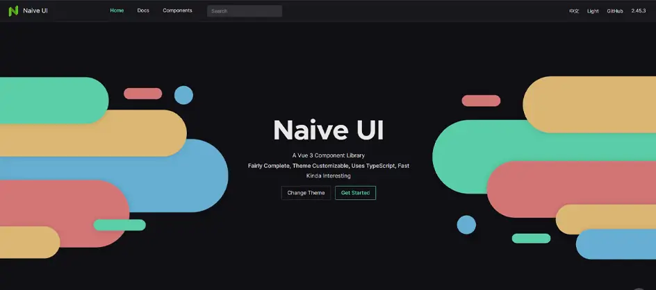
Naive UI is a fast, lightweight, and TypeScript-first component library built exclusively for Vue 3.
Key Features
- TypeScript First: Written entirely in TypeScript, providing strong type definitions and smooth auto-completions.
- Tree-Shakeable: Includes over 70-80 high-performing components, loading only what your application actually uses to keep bundle sizes small.
- Advanced Theming: Features a dynamic theming system that lets you alter global design tokens easily and export a customized theme directly.
- Universal Support: Comes with built-in native support for dark/light modes and Server-side rendering (SSR).
Ideal Use Cases
- Data-Dense Dashboard: Excels in high-performance admin panels and data visualization where speed and responsiveness matter.
- TypeScript Projects: Perfect for modern Vue 3 enterprise apps or startups heavily invested in strict type safety.
Installation
// Using NPM
npm install naive-ui

// Using Yarn
yarn add naive-ui
Example:
// App.vue file

<script setup>
import { NButton } from 'naive-ui'
</script>

<template>
  <NButton type="primary">
    Submit
  </NButton>
</template>
6. Reka UI
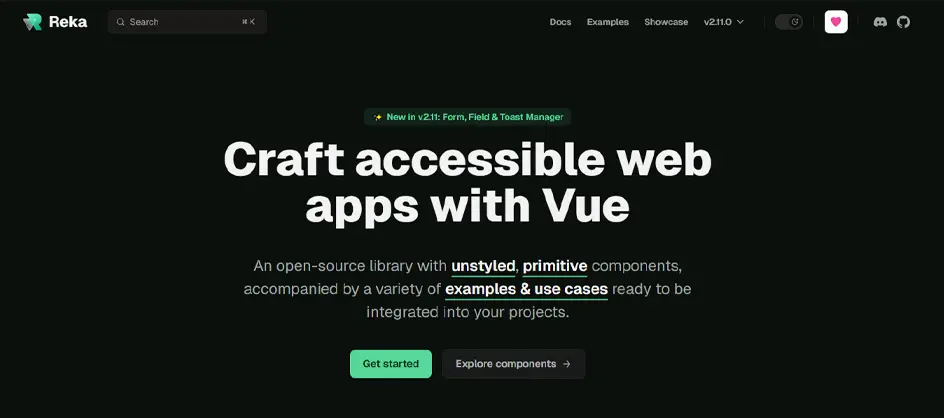
Reka UI, formerly known as Radix Vue, is an unstyled, headless, and accessibility-first primitive component library designed for Vue 3 and Nuxt applications.
Key Features
- Headless Architecture: It arrives with zero styles, giving you greater control over markup and CSS using Tailwind, CSS modules, or Vanilla CSS.
- Built-in Accessibility: Fully WAI-ARIA compliant, managing complex keyboard navigation, focus trapping, and screen reader announcements.
- Primitive Component Design: Thinks in granular building blocks such as DialogRoot, DialogTrigger, DialogContent, which follow the composite pattern for maximum flexibility.
- Flexible State Management: Supports both controlled and uncontrolled state patterns, adapting seamlessly for your data flow.
- Developer Experience: Fully typed with TypeScript, optimized for tree-shaking, and features utility props like asChild for element merging.
- Internationalization: Includes robust support for Right-to-Left (RTL) layouts, custom locales, and alternate numbering systems.
Ideal Use Cases
- Custom Design System: Building a proprietary, branded component library from scratch for an enterprise-grade business.
- Shadcn Vue Ecosystem: Serving as the underlying accessibility and logic engine for copy-paste component systems like Shadcn Vue.
- High-accessibility Apps: Developing healthcare, government, or financial applications where strict WAI-ARIA compliance and keyboard accessibility are mandatory.
- Tailwind-Driven UIs: Crafting highly customized web applications that leverage Tailwind CSS without fighting pre-backed component themes.
Installation
// Using NPM
npm install reka-ui

// Using Yarn
yarn add reka-ui
Example:
// App.vue file

<script setup>
import {
  DialogRoot,
  DialogTrigger,
  DialogContent
} from 'reka-ui'
</script>

<template>
  <DialogRoot>
    <DialogTrigger>
      Open Dialog
    </DialogTrigger>

    <DialogContent>
      Hello World
    </DialogContent>
  </DialogRoot>
</template>
7. Nuxt UI
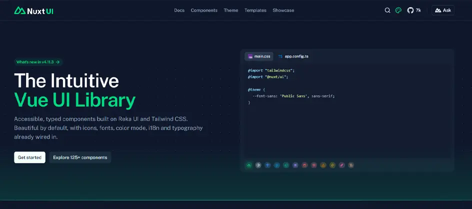
Nuxt UI is an open-source, production-ready Vue UI component library explicitly optimized for the Nuxt ecosystem. Styled with Tailwind CSS and built on top of accessible primitives like Reka UI, it offers a powerful design system for modern web applications.
Key Features
- Framework Optimization & SSR-First: Built from the ground up to take advantage of Nuxt’s file-based routing, server-side rendering (SSR), and static site generation (SSG). It prevents layout shifts and guarantees fast server response times.
- Built-in Accessibility (WAI-ARIA): Powered by Reka UI, components feature robust keyboard navigation, focus management, and fully compliant ARIA attributes.
- Advanced Customization via Tailwind Variants: Uses app.config.ts for type-safe global theme configuration. You can modify semantic color aliases, border radii, and styling scales through granular design tokens and slots.
- Massive Asset Ecosystem: Includes built-in support for 200,000+ Iconify icons and performance-optimized custom fonts, and automatic, glitch-free dark/light mode toggling.
- Enhanced TypeScript Support: Features robust generic-based components with full property auto-completion, type-safe theming, and smart event/slot interfaces.
- Rich Component Sandbox: You will get 125+ accessible components, ranging from low-level interactive forms with built-in validation to complex overlays (modals, tooltips, slide-overs) with automatic state management.
Ideal Use Cases
- SaaS Dashboards & Admin Panels: The library features pre-wired transaction lists, data tables, analytics charts, and multi-step forms. Pro elements help users build applications seamlessly.
- SEO-Sensitive and Content Site: Fully optimized for SSR/SSG workflows, making it an ideal selection for public blogs, eCommerce storefronts, and marketing sites that need fast initial server response time.
- Rapid MVP and Prototyping: Built-in keyboard shortcuts, preconfigured i18n/RTL localization layer, and exhaustive Figma kit allow the full app to scale from design to deployment in a couple of days.
Installation
// Using NPM
npm install @nuxt/ui

// Using Yarn
yarn add @nuxt/ui
Example:
// app.vue file

<template>
  <UButton>
    Submit
  </UButton>
</template>
8. TailGrids Vue
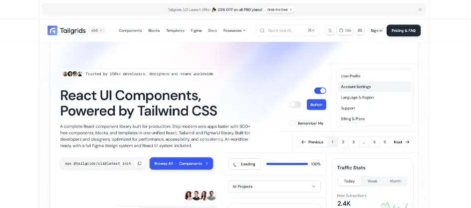
TailGrids Vue is a rich collection of Tailwind CSS UI components and pre-built blocks crafted specifically for Vue.js applications.
Key Features
- Extensive Component Library: Offers 600+ free as well as pro UI components, including bento grids, pricing sections, hero areas, blogs, and contact forms.
- Utility-first Styling: Fully built on Tailwind CSS, allowing greater customization directly through utility classes.
- Dark-mode Support: Includes dark and light theme configurations.
- Fully Responsive: Designed with a mobile-first layout to ensure apps will run smoothly across all screen sizes.
- Flexible Integration: Supports easy copy-paste workflows or package integration for quick scaffolding
Ideal Use Cases
- Marketing & Landing Pages: Quickly assemble high-converting landing pages, feature sections, and hero banners.
- Business & eCommerce Website: Scaffolding production-ready page blocks like product cards, testimonials, and pricing tables.
- AI & SaaS Web Applications: Quickly prototyping user dashboards and admin panels using a modern design system.
Installation
// Using NPM
npm install tailwindcss

// Using Yarn
yarn add tailwindcss
Example:
tailwind.config.js

/** @type {import('tailwindcss').Config} */
export default {
  content: [
    "./index.html",
    "./src/**/*.{vue,js,ts,jsx,tsx}",
  ],
  theme: {
    extend: {},
  },
  plugins: [
    require("tailgrids/plugin"),
  ],
};

Configure CSS in the src/style.css:-

@tailwind base;
@tailwind components;
@tailwind utilities;

Import the CSS in the src/main.js:-

import { createApp } from 'vue';
import App from './App.vue';

import './style.css';

createApp(App).mount('#app');


Create your first TailGrids UI in the src/App.vue:-

<template>
  <div class="min-h-screen bg-gray-100 flex items-center justify-center p-6">
    <div class="w-full max-w-md bg-white p-8 shadow-lg">
      <h1 class="mb-2 text-2xl font-bold text-gray-900">
        Welcome to TailGrids
      </h1>

      <p class="mb-6 text-gray-600">
        TailGrids + Vue + Tailwind CSS
      </p>

      <button
        class="w-full rounded-lg bg-primary px-6 py-3 text-center text-base font-semibold text-white transition"
      >
        Get Started
      </button>

    </div>
  </div>
</template>
<script setup>
</script>
9. Vuestic UI
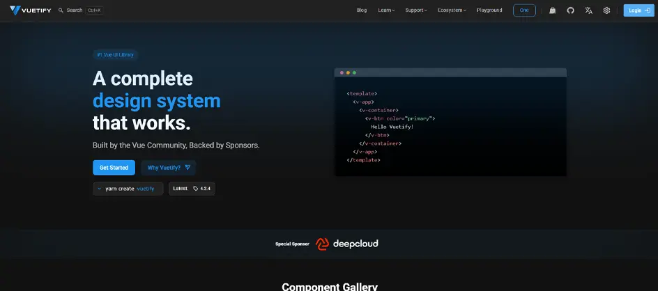
Vuestic UI is a free, open-source Vue 3 UI framework and modern component toolkit customized to build responsive web interfaces and admin dashboards.
Key Features
- Vue 3 & Vite Ready: Built for modern performance, utilizing a reactive stack, TypeScript support, and Pinia Integration.
- Extensive Component Library: Provides over 50 customizable UI elements, including data tables, cards, and advanced form controls.
- Built-in Dark Theme & Theming: Offers seamless switching between light and dark modes with global dynamic configuration for effortless styling.
- Internationalization (i18n): Localization support for global-ready applications.
- Style Isolation: Use BEM methodology and class prefixing to prevent styling conflicts with other CSS frameworks or legacy code.
Ideal Use Cases
- Admin Dashboard: Rapid deployment of back-office control panels featuring interactive charts, metric cards, and responsive sidebars.
- SaaS Platform: Building enterprise-grade user-facing app interfaces with corporate color schemes.
- CRM & Data-intensive Apps: Managing complex data tables, multi-step forms, and user profile management systems.
Installation
// Using NPM
npm install vuestic-ui

// Using Yarn
yarn add vuestic-ui
Example:
// main.js file

import { createApp } from 'vue'
import { createVuestic } from 'vuestic-ui'
import App from './App.vue'

const app = createApp(App)

app.use(createVuestic())
app.mount('#app')

// App.vue file

<template>
  <VaButton>
    Submit
  </VaButton>
</template>
10. Oruga UI
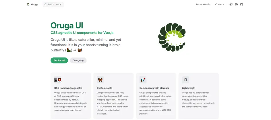
Oruga UI is a lightweight, CSS-framework-agnostic UI component library for Vue.js.
Key Features
- CSS-Framework Agnostic & Unstyled Philosophy: Oruga comes without a built-in design system or dependencies on Bootstrap, Tailwind, or Bulma. It offers only the structural CSS rules needed to make elements work, such as display, position, or z-index, acting as a clean canvas for your own branding.
- Flexible Styling Options: You can customize styles via a global or individual HTML class-mapping system, or leverage a rich set of native CSS variables to cleanly override visual behaviors.
- “Component with Steroids”: Rather than acting as basic wrappers over native inputs, Oruga components improve standard elements with rich, custom functional behaviors.
- Lightweight and Tree-Shakable: The library features zero external dependencies (aside from Vue itself). Every component can be imported individually, allowing your compiler to shake away unused code and minimize bundle sizes.
- Accessibility: Components are built from the ground up to follow WCAG recommendations and support screen readers and keyboard navigation.
- Multi-version Ecosystem: Offers native packages supporting both Vue 2 and Vue 3 environments seamlessly (@oruga-ui/oruga-next for Vue 3)
Ideal Use Cases
- Custom Corporate Design Systems: When your company has a strict, bespoke style guide created by a design team, Oruga handles the complex logical heavy lifting (dropdown behaviors, modal states, input validation hooks) while allowing you to inject your exact CSS rules cleanly.
- Tailwind CSS or Bootstrap Workflows: If you are already building a project using utility frameworks like Tailwind CSS, Oruga lets you hook your Tailwind classes directly into component elements via its class-mapping config, avoiding style conflicts.
- Performance-Critical Applications: When building lightweight web apps, progressive web apps (PWAs), or client-facing landing pages where small bundle footprints are vital, Oruga’s tree-shakable architecture prevents framework bloat.
- Future-Proofing Frontend Logic: Because Oruga decouples JavaScript logic from the presentation layer, you can rewrite your app’s entire look, switch frameworks, or rebrand down the line without altering a single line of component JavaScript.
Installation
// Using NPM
npm install @oruga-ui/oruga-next

// Using Yarn
yarn add @oruga-ui/oruga-next
Example:
// main.js file

import { createApp } from 'vue'
import Oruga from '@oruga-ui/oruga-next'
import App from './App.vue'

const app = createApp(App)

app.use(Oruga)
app.mount('#app')


// App.vue file
<template>
  <o-button>
    Submit
  </o-button>
</template>
11. Buefy

Buefy is a lightweight Vue UI component library based on the Bulma CSS framework, providing ready-to-use components for forms, navigation, notifications, tables, modals, and other common interface requirements.
Key Features
- Bulma-Based Design System: Buefy combines Vue components with Bulma’s responsive CSS framework, allowing developers to build consistent interfaces without writing every UI pattern from scratch.
- Lightweight Component Library: It focuses on commonly required interface elements rather than functioning as a complete application framework, making it suitable for projects that need a relatively simple UI layer.
- Responsive Components: Components inherit Bulma’s responsive approach, helping developers create interfaces that adapt across desktop, tablet, and mobile screen sizes.
- Reusable Form and Data Components: Provides buttons, inputs, selects, checkboxes, tables, pagination, date pickers, and other components commonly required in business applications.
- Flexible Customization: Developers familiar with Bulma can customize the appearance using Bulma’s CSS classes and variables while retaining Buefy’s component behavior.
- Vue Integration: Buefy provides Vue components that expose properties, events, and slots, making Bulma-based UI patterns easier to use within Vue applications.
Ideal Use Cases
- Bulma-Based Applications: When an existing project already uses Bulma, Buefy provides Vue-friendly components without requiring developers to replace the existing design system.
- Business and Admin Interfaces: Useful for dashboards, internal tools, CMS interfaces, and other applications that rely on standard forms, tables, navigation, and notifications.
- Content-Driven Websites: Suitable for websites that need responsive forms, menus, cards, pagination, and other common UI elements without adopting a larger framework.
- Small to Medium-Sized Vue Applications: A practical option when the project needs reusable components but does not require the extensive ecosystem of a full Vue application framework.
- Rapid UI Development: Developers can assemble common interface patterns quickly using prebuilt components instead of implementing Bulma styles and Vue behavior separately.
Installation
// Using NPM
npm install vant

// Using Yarn
yarn add vant
Example:
import { createApp } from 'vue'
import App from './App.vue'
import 'vant/lib/index.css'

createApp(App).mount('#app');

// App.vue file

<script setup>
import { Button } from 'vant'
</script>

<template>
  <Button type="primary">
    Submit
  </Button>
</template>
12. Vant
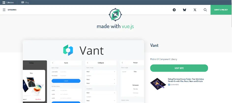
Vant is a mobile-first Vue UI component library designed for building responsive mobile web applications. It provides a large collection of touch-friendly components and supports Vue 3, Nuxt, tree-shaking, server-side rendering, dark mode, themes, and internationalization.
Key Features
- Mobile-First Component System: Vant is specifically designed around mobile interfaces, providing touch-friendly controls and layouts for smaller screens.
- Rich Component Collection: It includes components for buttons, forms, navigation, calendars, lists, popups, tabs, cards, cells, loading states, and many other mobile UI patterns.
- Vue 3 and Nuxt Support: Vant integrates with modern Vue applications and provides Nuxt support for projects requiring server-side rendering or the Nuxt ecosystem.
- Lightweight and Tree-Shakable: Developers can import only the components required by an application, helping reduce unnecessary JavaScript in production builds.
- Custom Themes and Dark Mode: The component styling can be customized to match application branding, while built-in dark-mode support makes it easier to create alternative visual themes.
- Internationalization: Vant provides internationalization capabilities for applications serving users across different regions and languages.
- TypeScript Support: Its TypeScript-based implementation provides better type checking and editor support during development.
Ideal Use Cases
- Mobile Web Applications: Vant is well-suited for applications where most users interact on smartphones or other touch devices.
- Mobile eCommerce: Useful for product listings, shopping carts, checkout interfaces, filters, popups, and other mobile shopping experiences.
- Booking and Reservation Platforms: Its mobile-friendly forms, calendars, tabs, lists, and navigation components work well for travel, appointment, and reservation applications.
- Fintech and Customer Portals: Suitable for mobile banking interfaces, account dashboards, payment workflows, and customer self-service portals.
- Progressive Web Apps (PWAs): Its lightweight, mobile-oriented component architecture makes it a good option for PWAs where responsive performance matters.
- Nuxt-Based Mobile Interfaces: Vant can be integrated into Nuxt applications that need a mobile-focused component system alongside server-side rendering.
Installation
// Using NPM
npm install vant

// Using Yarn
yarn add vant
Example:
// main.js

import { createApp } from 'vue'
import App from './App.vue'
import 'vant/lib/index.css'

createApp(App).mount('#app')

<!-- App.vue -->

<script setup>
import { Button, Field, CellGroup } from 'vant'
</script>

<template>
  <van-cell-group inset>
    <van-field
      label="Username"
      placeholder="Enter username"
    />

    <van-button type="primary" block>
      Submit
    </van-button>
  </van-cell-group>
</template>
13. Vuesax

Vuesax is a Vue UI component framework focused on providing modern, customizable interface components without forcing applications into a single rigid visual style. It includes components for forms, navigation, data presentation, notifications, dialogs, and other common application requirements.
Key Features
- Modern Component Collection: Vuesax provides reusable components for buttons, inputs, cards, tables, tabs, dialogs, pagination, notifications, sidebars, and other interface patterns.
- Flexible Visual Customization: Developers can customize component colors, shapes, sizes, and other visual properties to better match an application’s branding.
- Interactive UI Components: It provides components for dropdowns, dialogs, notifications, menus, popups, and other interactive behaviors that would otherwise require custom JavaScript.
- Form and Data Components: Vuesax includes common form controls as well as tables, pagination, progress indicators, and other components for data-heavy applications.
- Vue 3 Availability: The vuesax3 package provides a Vue 3-oriented implementation for modern Vue projects.
- Reusable Architecture: Components can be integrated individually, allowing developers to build interfaces using only the elements the application needs.
Ideal Use Cases
- SaaS Applications: Vuesax can provide a modern visual foundation for SaaS dashboards, account areas, settings pages, and other product interfaces.
- Admin Dashboards: Its tables, forms, navigation, cards, dialogs, and notification components are useful for building administrative interfaces.
- Business Management Systems: Suitable for CRM, ERP, project management, inventory, and other internal business applications.
- Analytics Interfaces: Components such as cards, tables, progress indicators, tabs, and navigation elements can help structure data-heavy dashboards.
- Custom Web Applications: Useful when developers want ready-made components but still need considerable control over the application’s visual appearance.
- Projects Requiring a Distinctive UI: Vuesax can be considered when a project needs a more visually distinctive interface rather than strictly following Material Design or another established design system.
Installation
# Using NPM
npm install vuesax3

# Using Yarn
yarn add vuesax3
Example:
// main.js
import { createApp } from 'vue'
import App from './App.vue'

import Vuesax from 'vuesax3'
import 'vuesax3/dist/vuesax.css'

const app = createApp(App)

app.use(Vuesax)

app.mount('#app')
<!-- App.vue -->

<template>
  <div>
    <vs-button>
      Submit
    </vs-button>
  </div>
</template>
14. Vuikit

Vuikit is a Vue UI toolkit based on the UIkit design system, providing reusable components and responsive interface patterns for Vue applications. It is particularly relevant for projects that already use or prefer the UIkit ecosystem.
Key Features
- UIkit-Based Component System: Vuikit brings UIkit’s modular design language and interface patterns into Vue applications.
- Modular Architecture: Developers can work with individual UI components rather than adopting a complete application framework.
- Responsive Design: The underlying UIkit system provides responsive layouts and components that can adapt to different screen sizes.
- Reusable Interface Elements: Supports common patterns such as buttons, forms, navigation, cards, menus, layouts, and other website components.
- Consistent Design Language: Applications can maintain a consistent UIkit-based visual language across different pages and features.
- Customizable Interface: Developers can adapt UIkit-based styling to match their application’s branding and design requirements.
Ideal Use Cases
- UIkit-Based Projects: Vuikit is most useful when an existing project already relies on UIkit and needs Vue integration.
- Corporate Websites: Its structured components and responsive layout system can support professional corporate websites and business portals.
- Content-Driven Websites: Suitable for documentation sites, publishing platforms, blogs, and other content-heavy interfaces requiring consistent navigation and layout components.
- Responsive Web Applications: Useful for applications that need a modular UI system capable of adapting across desktop and mobile screens.
- Marketing Websites: Developers can use its layout, navigation, cards, buttons, and other components to quickly create structured marketing pages.
- Existing UIkit Design Systems: Organizations already using UIkit can consider Vuikit when introducing Vue into their frontend architecture.
Installation
# Using NPM
npm install vuikit

// Using Yarn
yarn add keen-ui
Example:
// main.js

import { createApp } from 'vue'
import App from './App.vue'

import Vuikit from 'vuikit'
import 'vuikit/dist/vuikit.css'

const app = createApp(App)

app.use(Vuikit)

app.mount('#app')


<!-- App.vue -->

<template>
  <div>
    <vk-button>
      Submit
    </vk-button>
  </div>
</template>
How to Choose the Best Vue UI Component Library
Choosing the best Vue UI component library depends on your project goals, design requirements, and CSS stack preference. Because there is no single ‘perfect’ library for each project, evaluating them against a few of the following criteria will narrow down your search immediately.
1. Design System & Flexibility
- Opinionated Libraries: Provide a ready-made aesthetic (like Google’s Material Design or Bootstrap). They are excellent for internal tools or dashboards but difficult to heavily customize.
- Unstyled / Headless Libraries: Provide underlying functionality, accessibility, and logic but leave the styling entirely on you (usually via Tailwind CSS). Perfect for a bespoke company design system.
2. Vue 3 and TypeScript Support
Ensure the library fully supports Vue 3 and features strong TypeScript typing for autocomplete and type safety.
3. Accessibility (a11y)
Look for libraries that comply with WCAG and WAI-ARIA guidelines, handling complex keyboard navigation and screen reader attributes automatically.
4. Bundle Size & Tree-Shaking
Ensure the library allows you to import individual components rather than forcing you to pack the entire framework into your production bundle.
Conclusion
The best Vue UI component library depends on the type of application you are building and how much control you need over its design and architecture. PrimeVue, Vuetify, and Element Plus are strong choices for feature-rich applications, while Quasar and Ionic Vue are better suited to projects that target multiple platforms. While the companies hire Vue.js developers who want to prioritize custom design systems and utility-first styling, Reka UI and Nuxt UI provide greater flexibility.
So, before selecting a library, evaluate its Vue 3 support, component coverage, accessibility, TypeScript support, theming capabilities, performance, documentation, community activity, and compatibility with your existing development stack. Choosing a library that matches your project’s requirements can reduce development effort while providing a more consistent and maintainable user interface.
FAQs
What is the best UI library for Vue?
The best UI library for Vue depends on your styling philosophy and project requirements, as modern Vue development has shifted from rigid, pre-styled frameworks to a flexible, utility-first ecosystem.
Why is Vue 3 better than Vue 2?
Vue 3 is better than Vue 2 because it offers faster performance, native TypeScript support, and the modern Composition API for reusable code and a more efficient reactivity system.
How do Vue.js UI component libraries reduce development time?
Vue.js component libraries reduce development time by eliminating the need to build UI elements from scratch, letting developers focus on core business logic.
Is Vue faster than React?
Yes, Vue is faster than React in raw client-side performance, DOM manipulation, and memory efficiency.
What is the best CSS library for Vue UI components?
There is no single ‘best’ CSS library for Vue UI components because the right choice heavily depends on your design requirements, development workflow, and styling preference.
Table of Contents